Hi, my name's Eugene. Nice to meet you!
I'm a full-cycle product designer with 14+ years of experience in digital products, both web and mobile.
Passionate about solving complex problems, improving design efficiency, and creating user-friendly experiences. Have worked on products with 10MM+ monthly users.
For the last few years, I've been deeply into coding. Can write solid HTML, CSS and Javascript.
Currently working with ![]() BandLab.
BandLab.
Selected Works
Here I’ve chosen some examples of my work to show the aesthetics and the reasoning behind my design decisions.
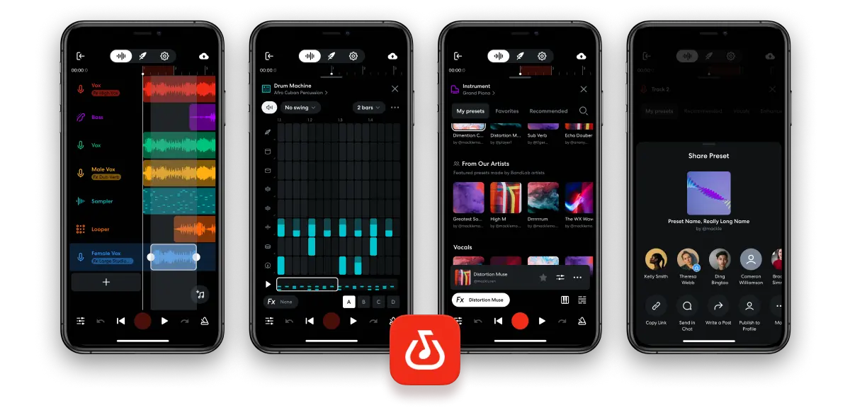
BandLab
BandLab allows to create and share your music with the world. It is a combination of a recording studio and a social network for musicians. Over 10M people use mobile Studio every month.
I've been working with BandLab's mobile Studio for over 2.5 years, having updated some of the existing features and created a few new ones. Highlights: Drum Machine redesign, Automation, Sampler edit mode, Vocal Comping, Track bar, Fx library redesign.
The app became the finalist of the “iPhone App of the Year” award, nominated by Apple in 2025.
Personal Project, Founder
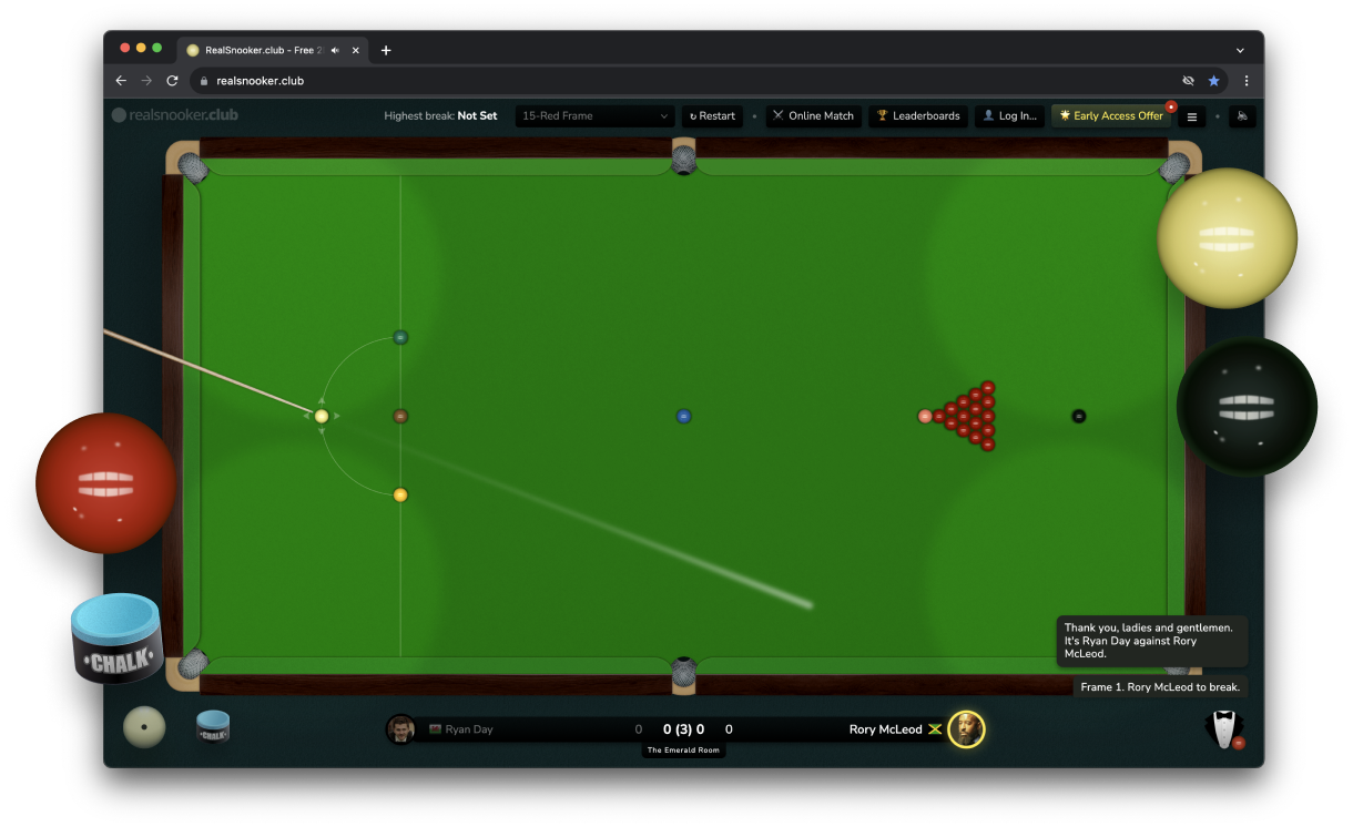
RealSnooker.Club
RealSnooker.Club is a browser snooker simulator game with a feel of a professional match table.
All physics in the game have been meticulously tweaked and tested to simulate the movement and different effects of real balls on cloth.
The game also includes a referee that observes the game and executes the game rules. Other game mechanics like chalk and miscue have been introduced for a more life-like experience. The game is free to play, however, a paid option is planned.
Idea, design, illustrations, and frontend programming is done by me. In partnership with Maxim Sein and Eli Straykov.
Co-founder
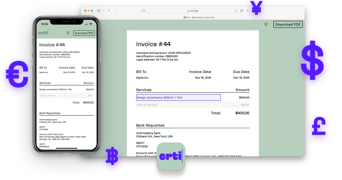
Erti Invoice
Erti is a simple invoice builder that doesn't have the usual complexity of other competitors.
The white sheet works as a preview and allows to craft a perfect invoice with no fuss. As simple as it looks, the app has many minor nuances that make working with it smooth and pleasant.
Made in partnership with Eli Straykov and Maxim Sein. Frontend programming on Rails and partial design is done by me. Idea and original design by Eli.
Personal Project, Founder
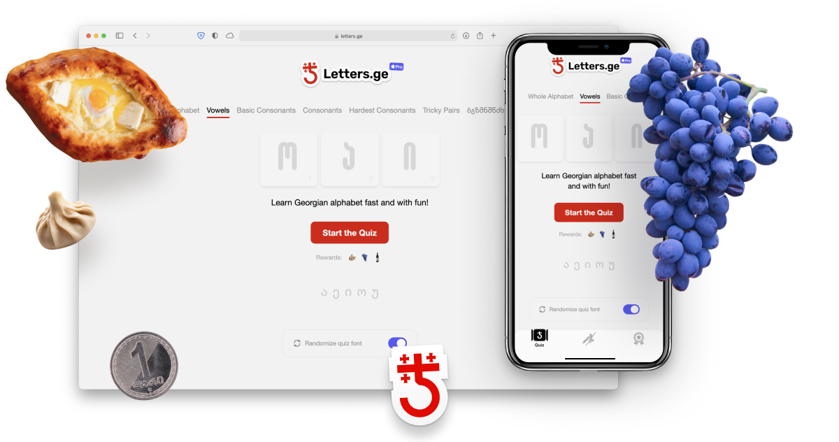
Letters.GE
Letters.GE is a fun and smart way to learn Georgian alphabet. The trainer allows to memorize letters by ear without having to use letter transcriptions.
The trainer has a reward system to stimulate learning. A reward is granted upon quiz finishing—a random small piece of Georgia such as a national dish or a sword, with a Georgian name included.
Idea, design and frontend programming is done by me. iOS web view app by Eli Straykov.
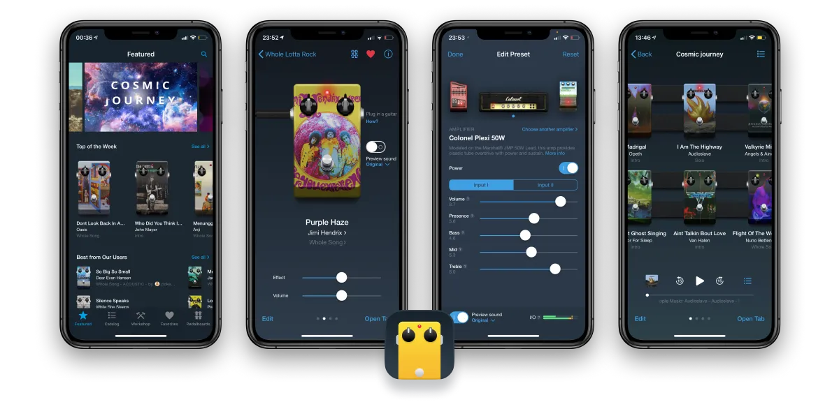
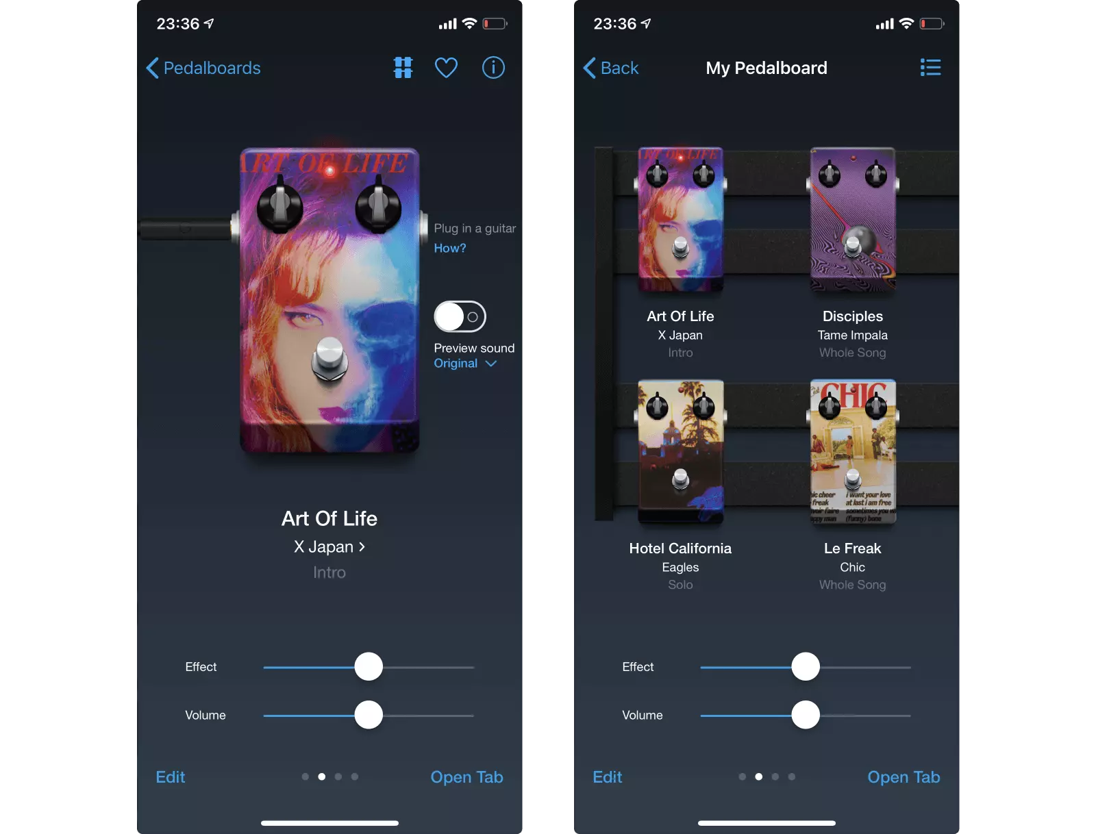
Tonebridge Guitar Effects
Tonebridge was one of my main activities at Ultimate Guitar for almost 3 years.
The app is a guitar amp simulator that gives you the sound of the original song without requiring knowledge of the guitar gear. All you need is to plug in a guitar into your device, select a song and start playing.
I managed the launch and lead the design and development of the app, lauching it for iOS, Android and macOS. Conducted yearly and monthly strategic product planning. Solely managed the app's Instagram and Twitter accounts.
In two years, the app got 2M+ overall downloads, 4.8 average rating in the App Store, and was featured by Apple and Google on various occasions.
One of the first reviews by Sean Halley from Guitar Tricks, 2016
A brief Tonebridge demonstration by Laney amps at NAMM, 2018
Walkthrough by Jamstack, 2019
After the release of the app we received various feature requests from the users. One of the most popular ideas was the ability to quickly switch between presets.
Tonebridge was mainly created for home guitarists, and such a feature would add unnessessary complications to the UI. Thus, we kept putting the idea aside. It was just one time when that I made a quick draft of it:
The horizontal design didn’t combine with the vertical layout of the app. The whole concept needed rethinking, and we wrote the design off.
However, we continued to get feedback from people who needed the feature for live performances. That finally seemed like a valid reason to give it a try. The first attempts to make the design vertical were not a success:
We aimed to keep Tonebridge simple and intuitive to use, and this was far from being simple. But then it hit me:
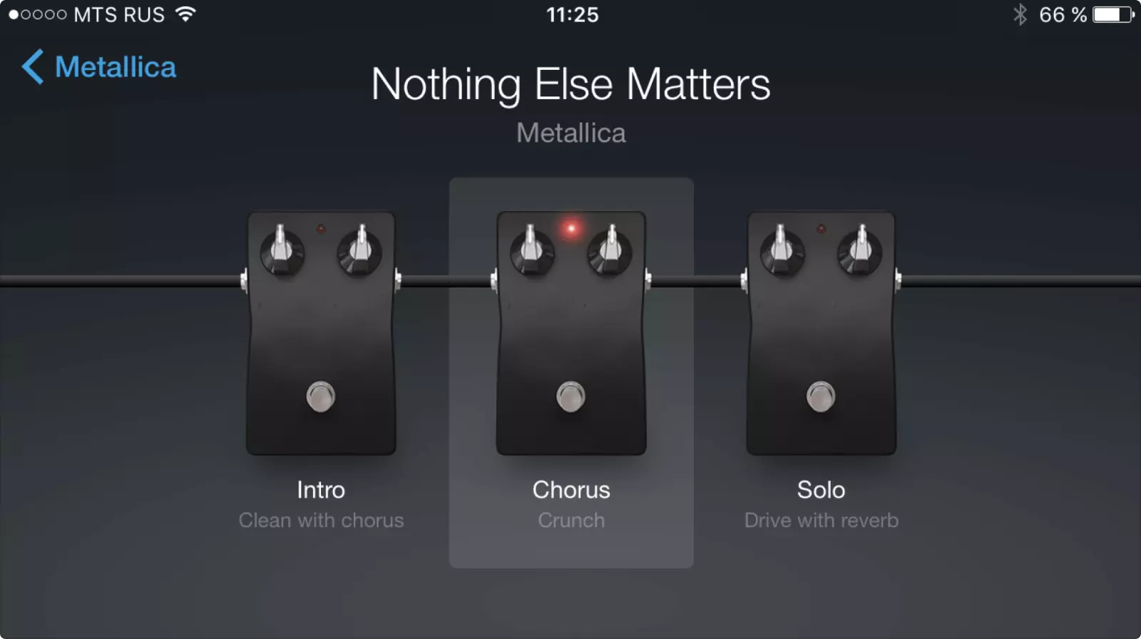
Guitarists use sound effects pedals all the time. To quickly switch between effects, they use a pedalboard—a board or a panel that serves as a container, patch bay, and power supply for the pedals.
I looked through the pedalboard designs and found one that looked the closest to what I’d expected:

Now it all was coming into place. The pedalboard concept was intuitive for the majority of guitarists. The layout was easily reusable. The pedal controls could remain the same. It was basically a multiplication of the single pedal layout. The ideas bound together very naturally:
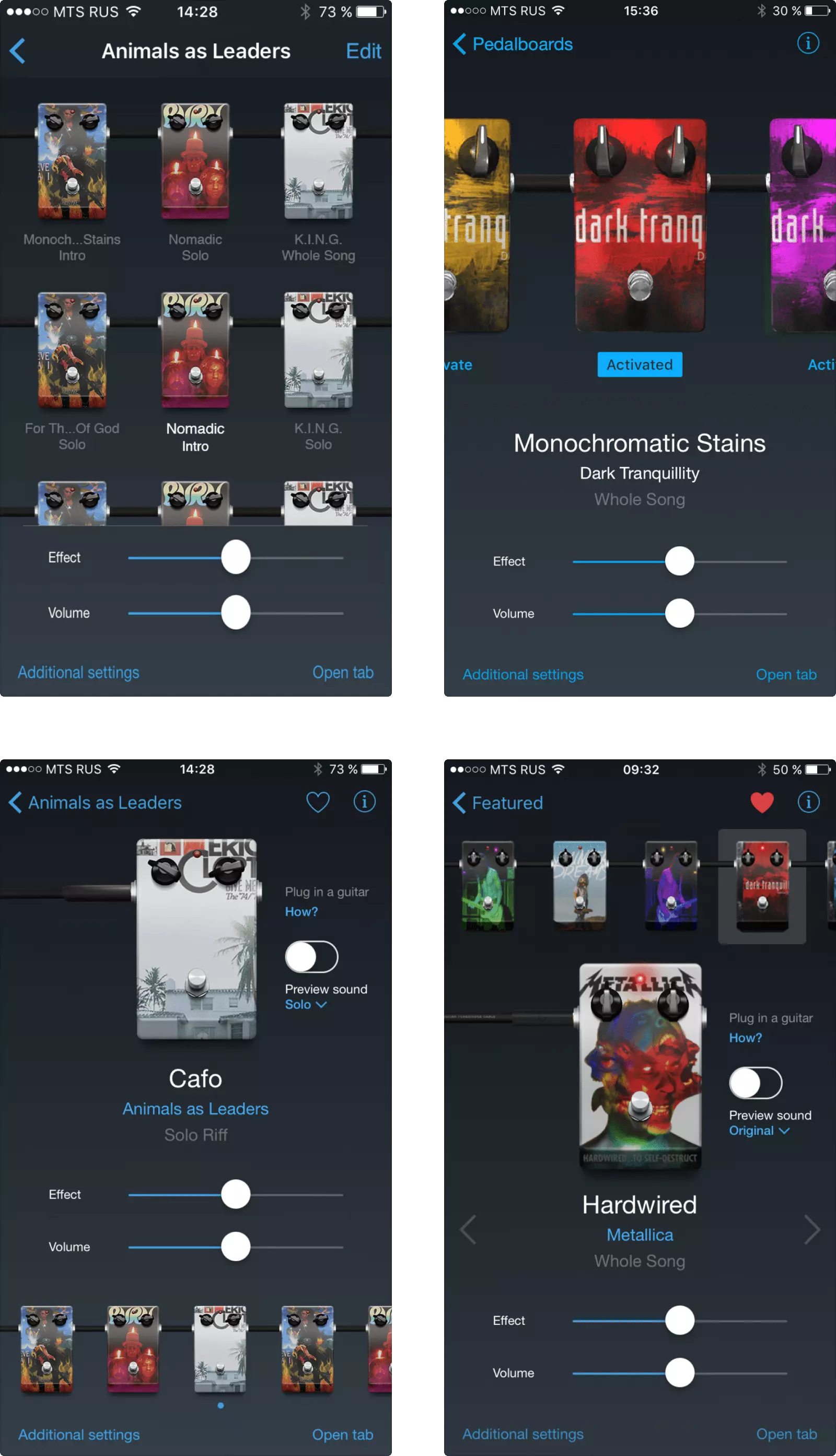
With the design, we managed to maintain consistency across the app, and reduce the development cost. The only hard part was to create a layout that would use the most available space depending on the screen size.
Here are some of the ideas behind the design:
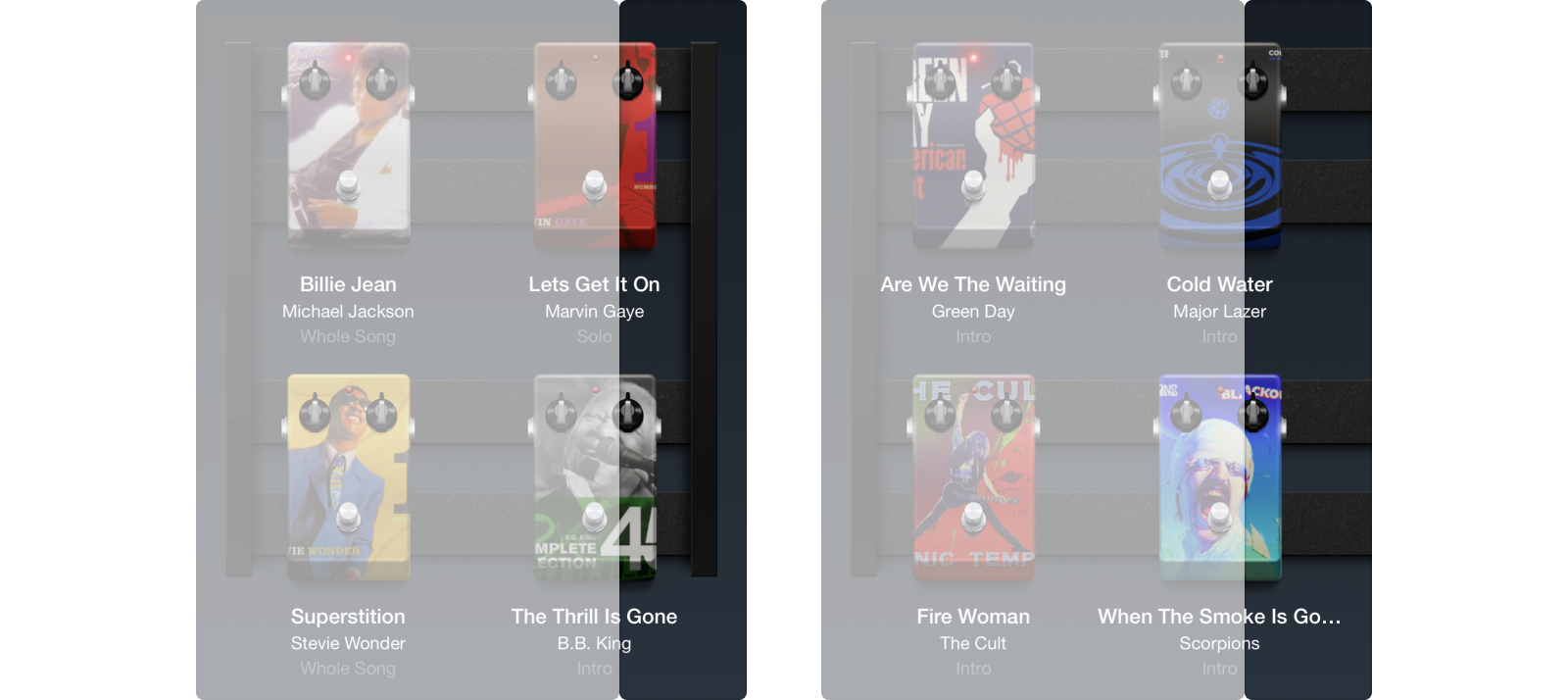
The pedalboard is designed to be obviously scrollable when the number of pedals is greater than the screen can hold.
The pedals fill the screen as effectively as possible, so an iPad will display more pedals an iPhone. And if the device is rotated, the pedalboard will resize accordingly.
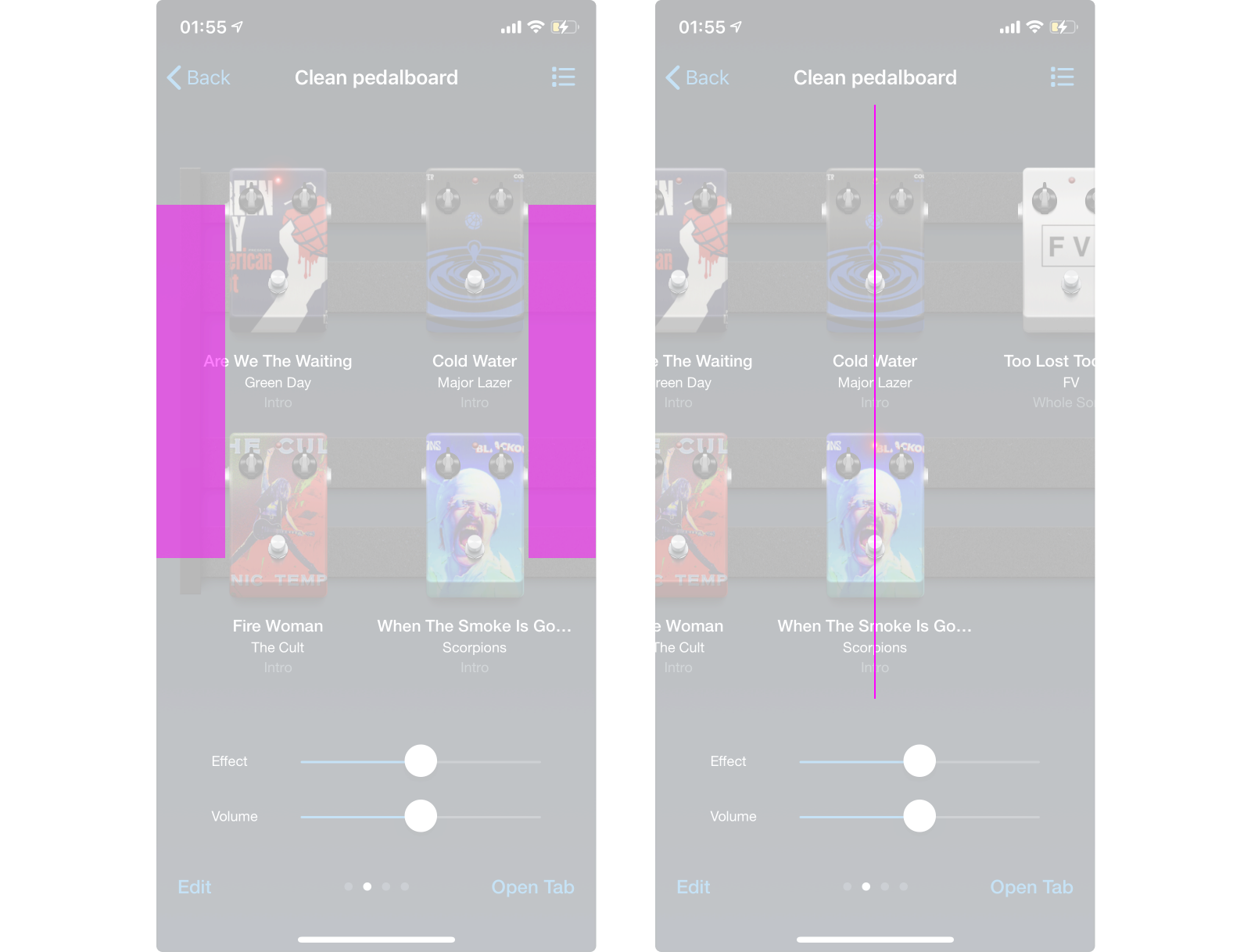
Selecting a pedal makes it jump to the center of the screen. Along with looking aesthetically good, this makes switching the pedals easier, as the next pedal will always jump under the finger.
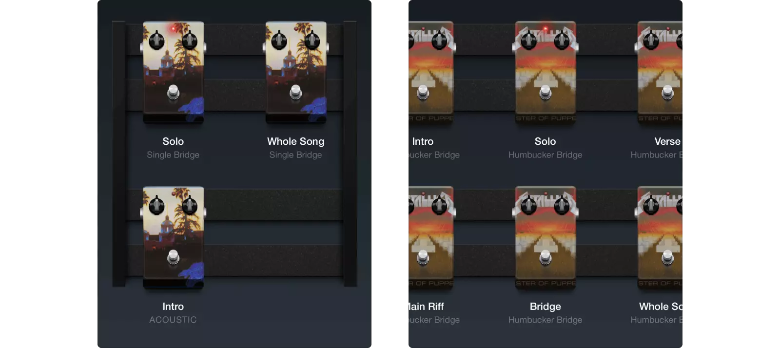
If a pedalboard is constructed out of pedals for the same song, the song parts will be displayed instead of the song’s and artist’s names.
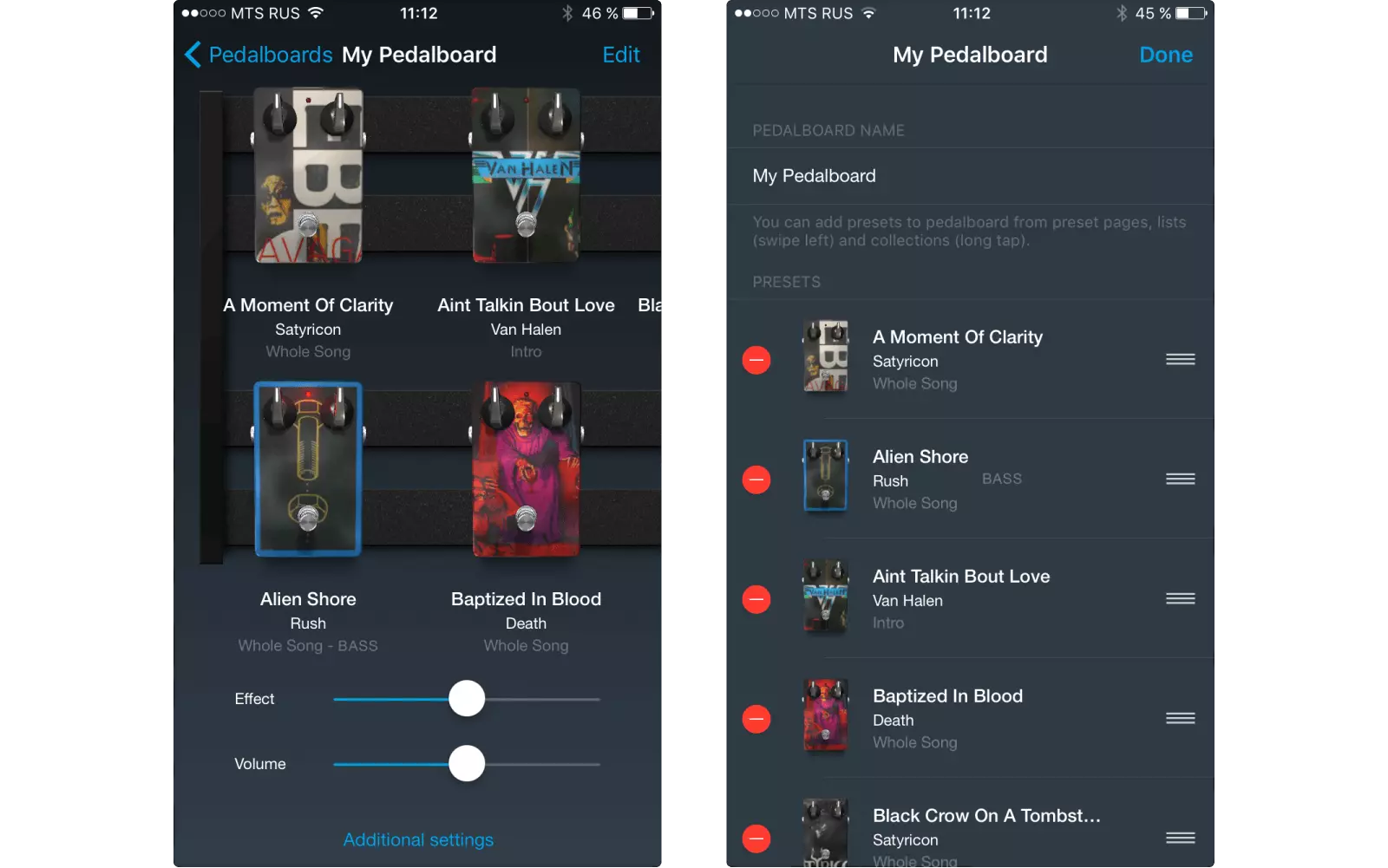
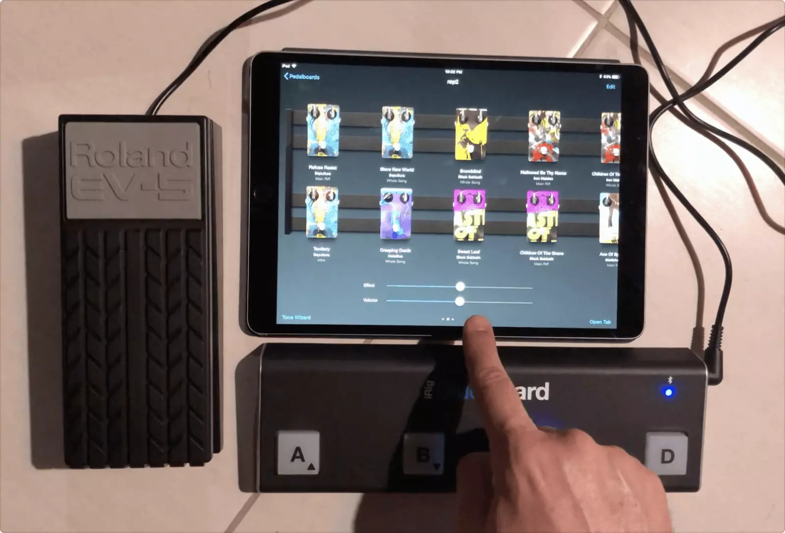
By the user’s taste, the pedals can be rearranged right on the pedalboard or by using the standard system controls.
Since the feature launch, Tonebridge users have created thousands of pedalboards, making it one of the most popular features in the app.
This little 3D fella was a big journey for me and the team:
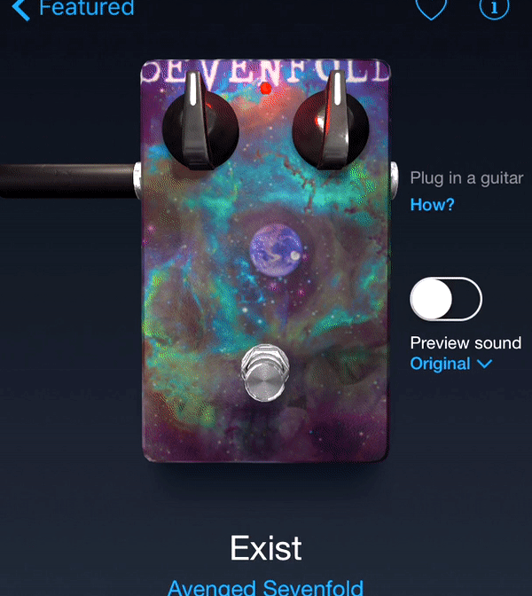
The pedal is a real 3D object that reacts to the device movement, making the illusion of depth and realism. Here is how we managed to do it.
In September 2016, Apple released iPhone 7, including their gorgeous jet black model. The product page showed a stunning photorealistic 3D animation of the phone with moving light and flares when scrolled:
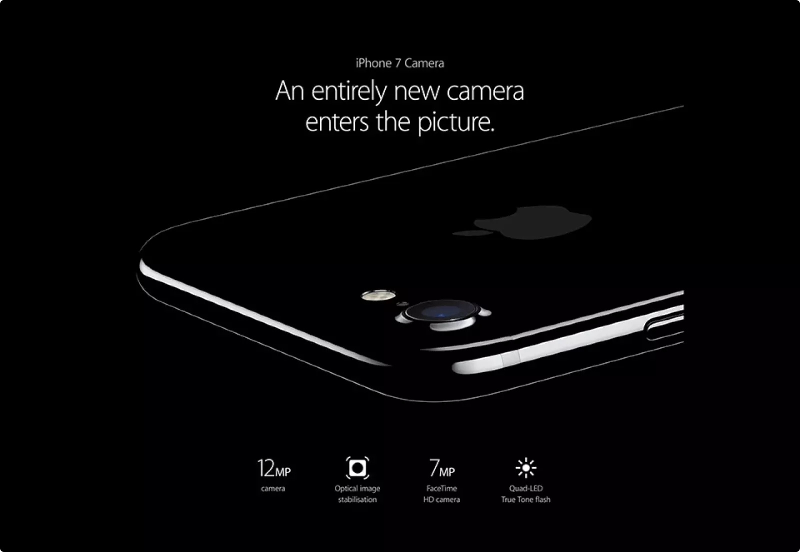
These animations inspired us to improve the pedal in the application by making it alive. During the exploration stage, we realised that it might be hardly possible. First, the animation turned out to be a video, not real 3D. Secondly, the performance of the mobile devices at that time was not impressive. So, showing a realistic 3D model in real time seemed to be a wild goose chase. Thirdly, we had no idea of how to work with 3D.
Nevertheless, we found an experienced 3D artist and started working:
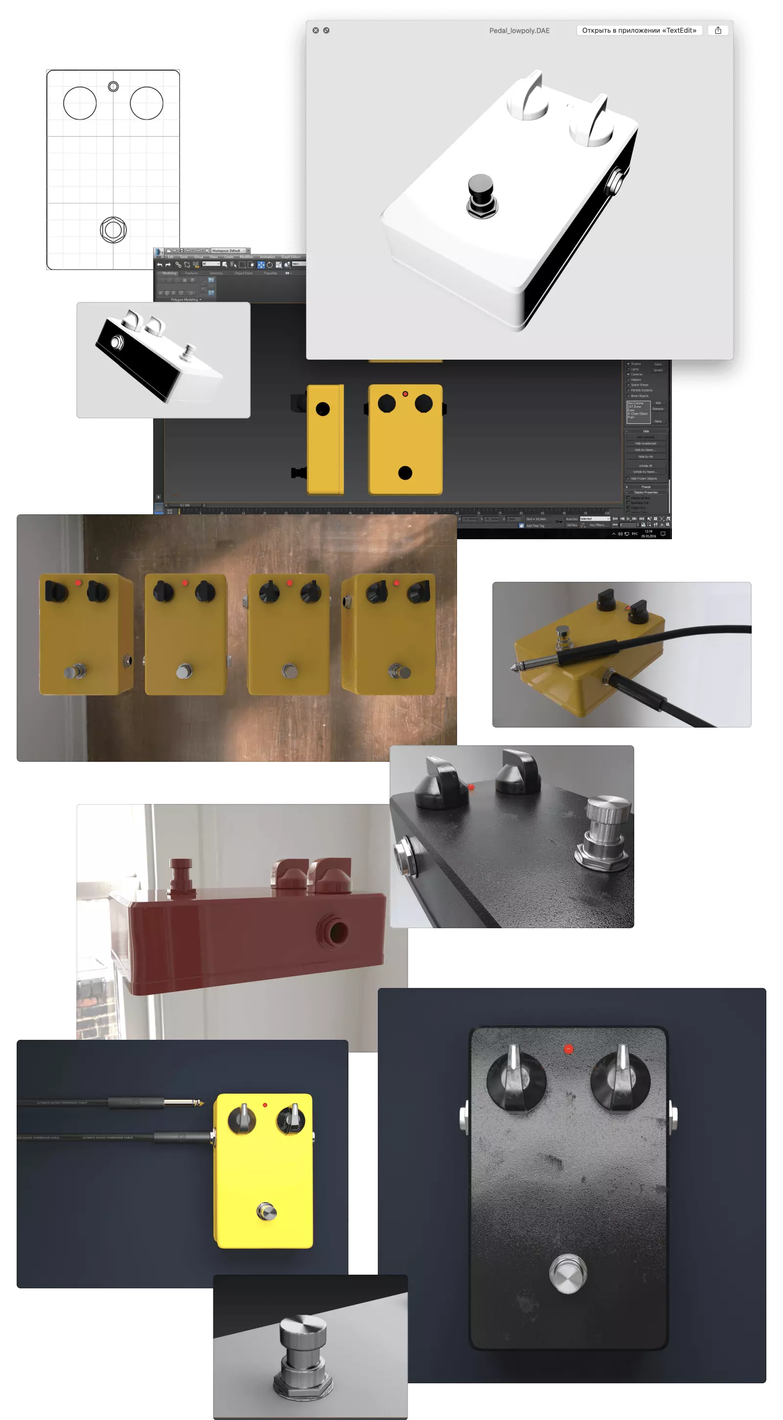
When the model was ready, the remained job was to build it into the app and adjust the materials, light and cameras. The artist had created the pedal in 3D Max and managed to make realistic photographic renderings, while in the app, the model had to be displayed in real time and on a low-performing device.
After a long struggle with SceneKit, we managed to integrate the model into the application, and the result disappointed us. The pedal turned out to be completely different from the beautiful renderings which the artist had sent us before:
We tried to make the pedal as realistic as possible by working with hundreds of the material properties, by figuring out right normals of the surfaces, and by finding the best angles for the light sources and cameras.
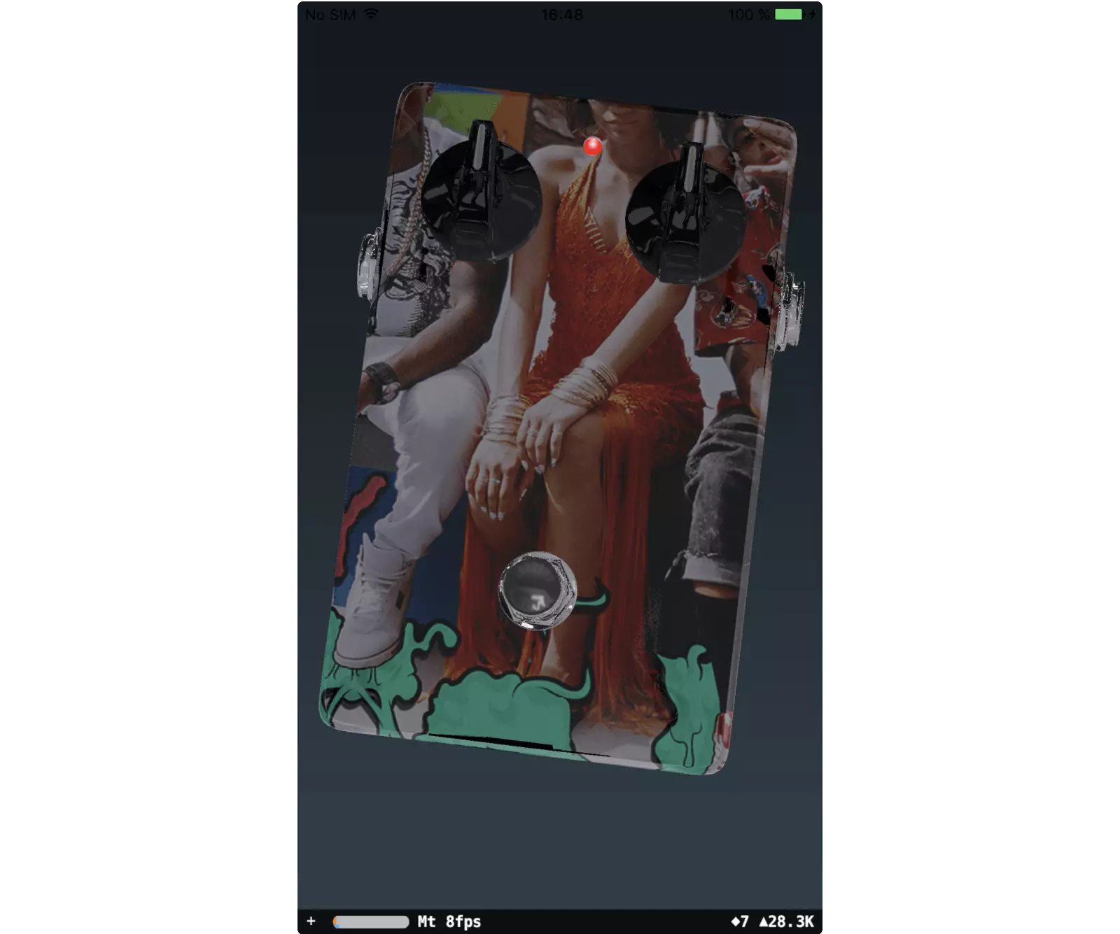
Changing a setting and then compiling a build for improvement was a time waster. So, we decided to display and adjust all the variables right in the app. The work went much faster:
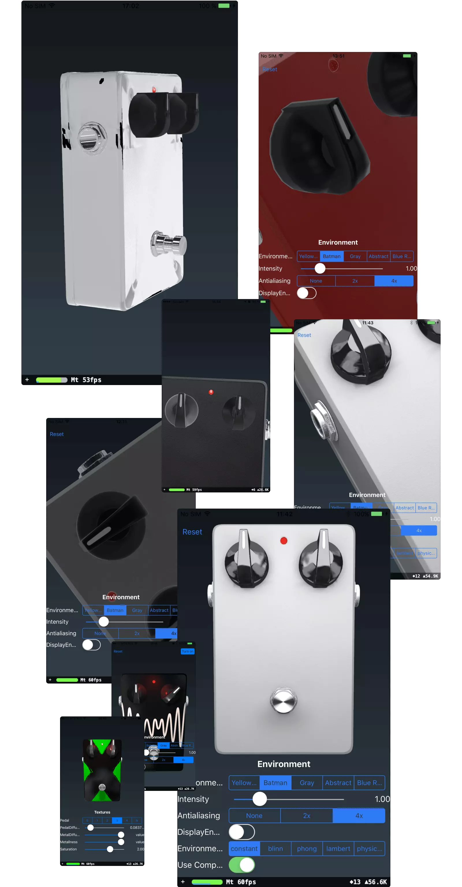
Most of the visual work was done by me. After several weeks of working with textures, SceneKit bugs, countless attempts to befriend the 3D model with the album covers, we finally received an eye-pleasing image:

In comparison with the original, the 3D pedal turned out to look more realistic, because the materials and light were real unlike those made by hand in Photoshop:

The final touch was to make the pedal move. We linked its axes to the movements of the phone via the gyroscope data. This way, the pedal would slightly tilt in the direction opposite to the phone's movement:
P. S. Unfortunately, the pedal has lived in the app for about 2 years. The release of iOS 12 brought a bug to SceneKit making the app freeze the device. So, we had to roll back to the original pedal.
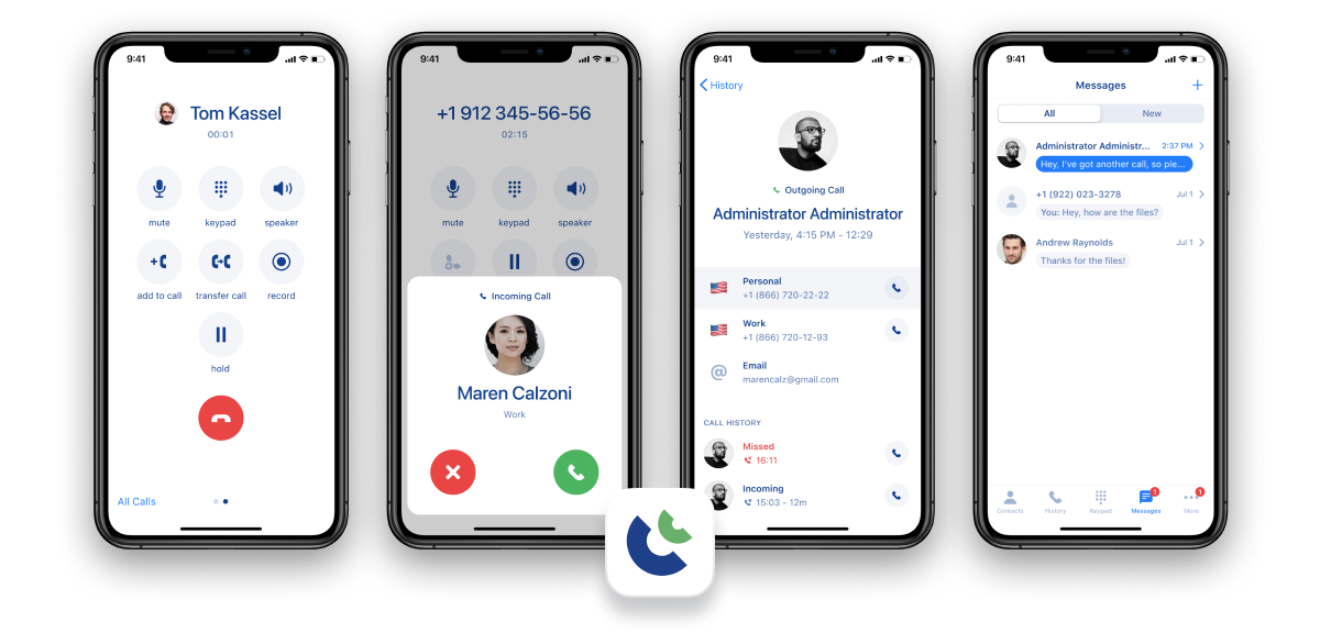
Inperium Talk
Talk by Inperium is a comprehensive cloud phone system designed to streamline communication for both businesses and individuals. It offers essential features such as making calls, sending messages, using voicemail, and setting up conference and parallel calls.
I worked on the design for the iOS and Android apps for over 2 years. I designed the app from scratch, starting with making calls, and further adding feachures such as messaging, voicemail, parallel calls, conference calls, and more.
For every feature, I made an interactive prototype, which helped the team test the ideas and saved a lot of development time. I interacted directly with product owners and discussed the features with the dev team to find the balance between design and development.
In the video, I present the feature to the team and show two use cases: adding 1 person to a call and adding multiple people to a call.

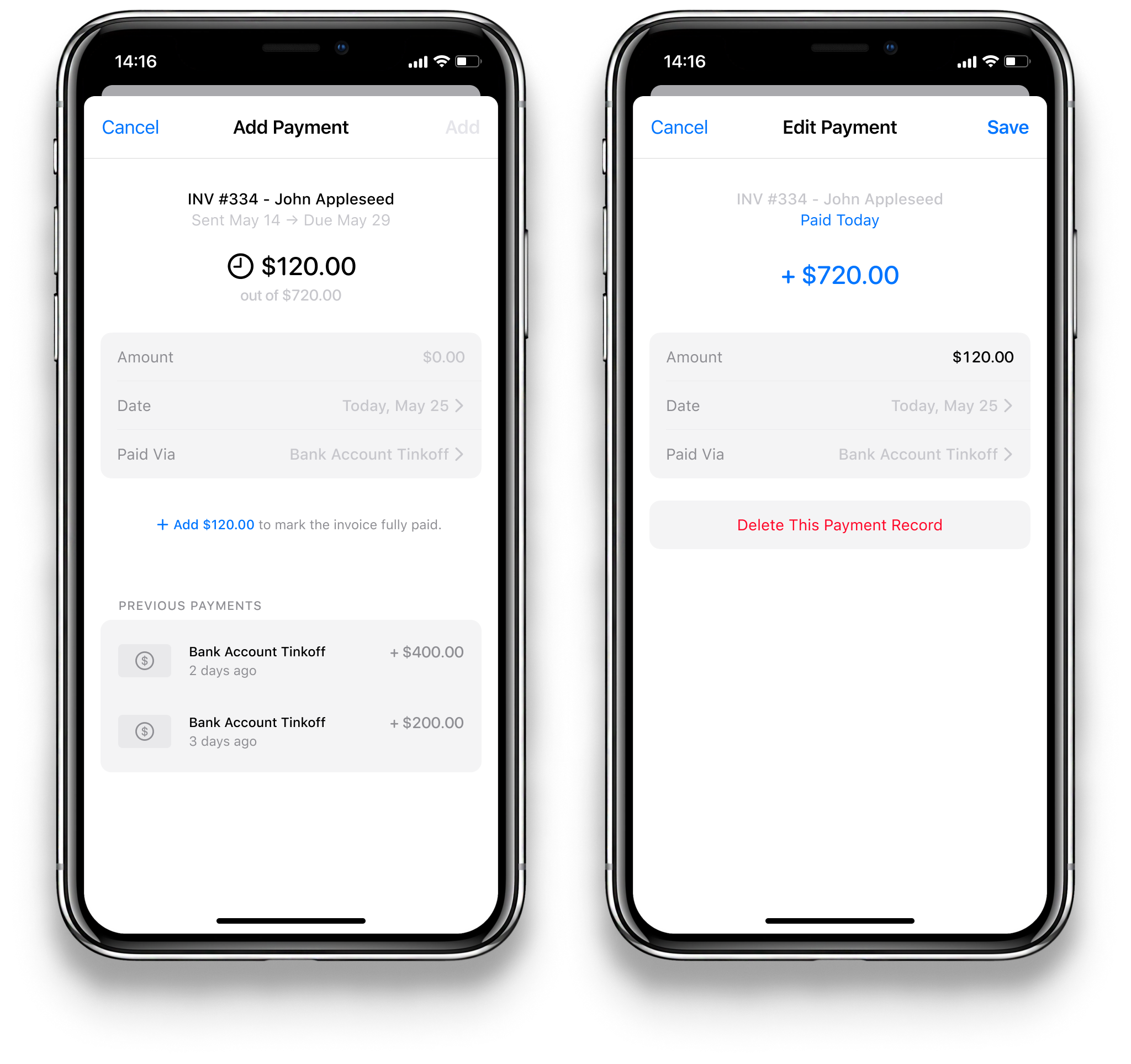
Invoice Maker
Invoice Maker by Saldo Apps offers invoice generating on the go for small businesses and individuals. The app is designed to be an accounting business partner, bringing all the vital information upfront.
I made the design for the iOS, iPad, and web apps, starting with the concept and initial design idea, and continuing with a live prototype, the design system, and screen construction based on included features. The app is arranged in a way of catalog, bringing the frequently used information upfront, but allowing the user to get any information they need. Aiming for simplicity and clarity, I re-thought the habitual design approach in some features and the overall app concept.
The app's main screen was designed to have everything at a glance. It brings immediate value and develops a healthy habit of periodical checks:
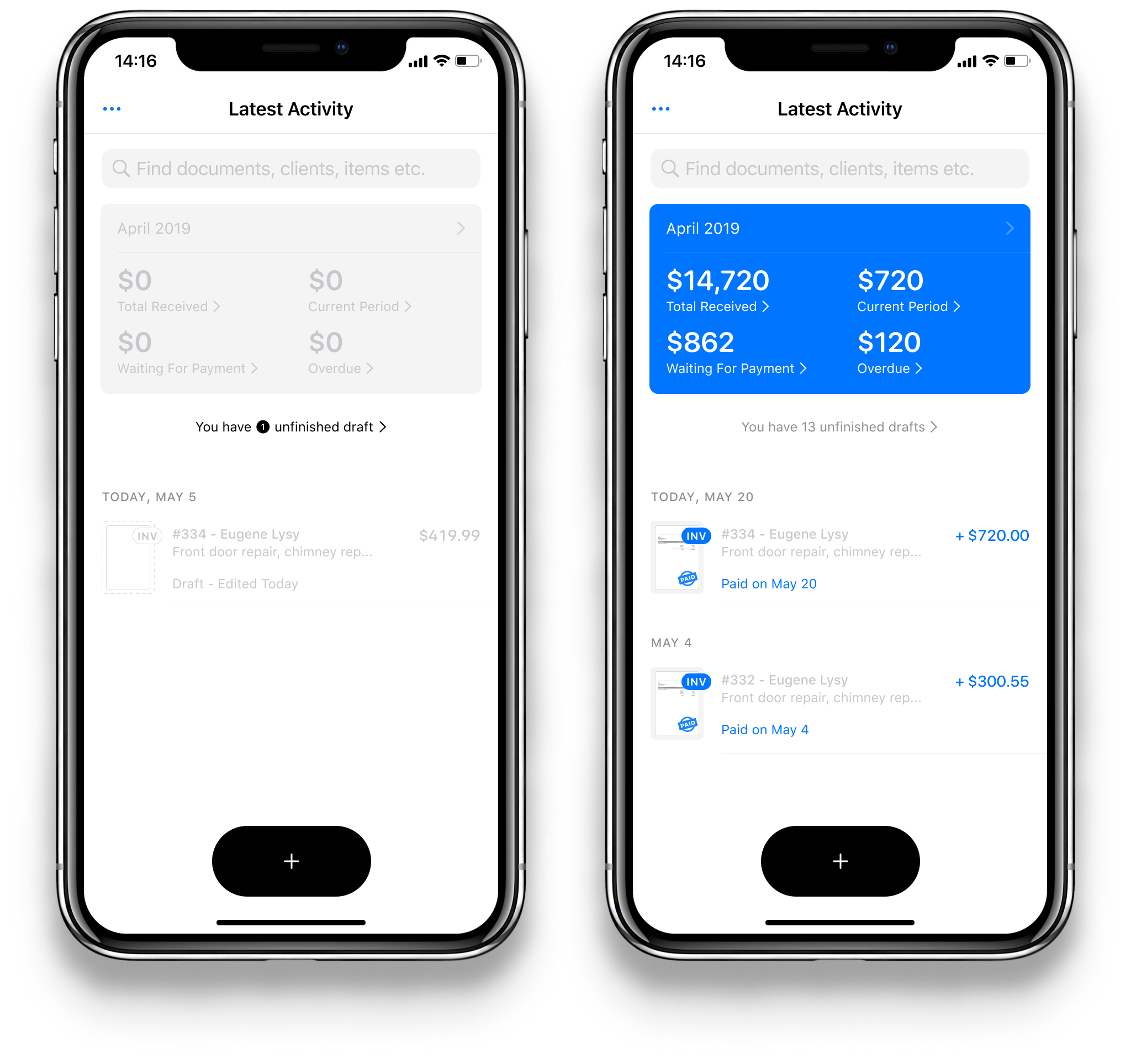
When user hasn’t sent any invoices yet, the app appears greyish. This helps to bring up the main button and keep the screen less noisy. After at least one invoice has been sent to a client, the app’s main screen starts to appear in colour.
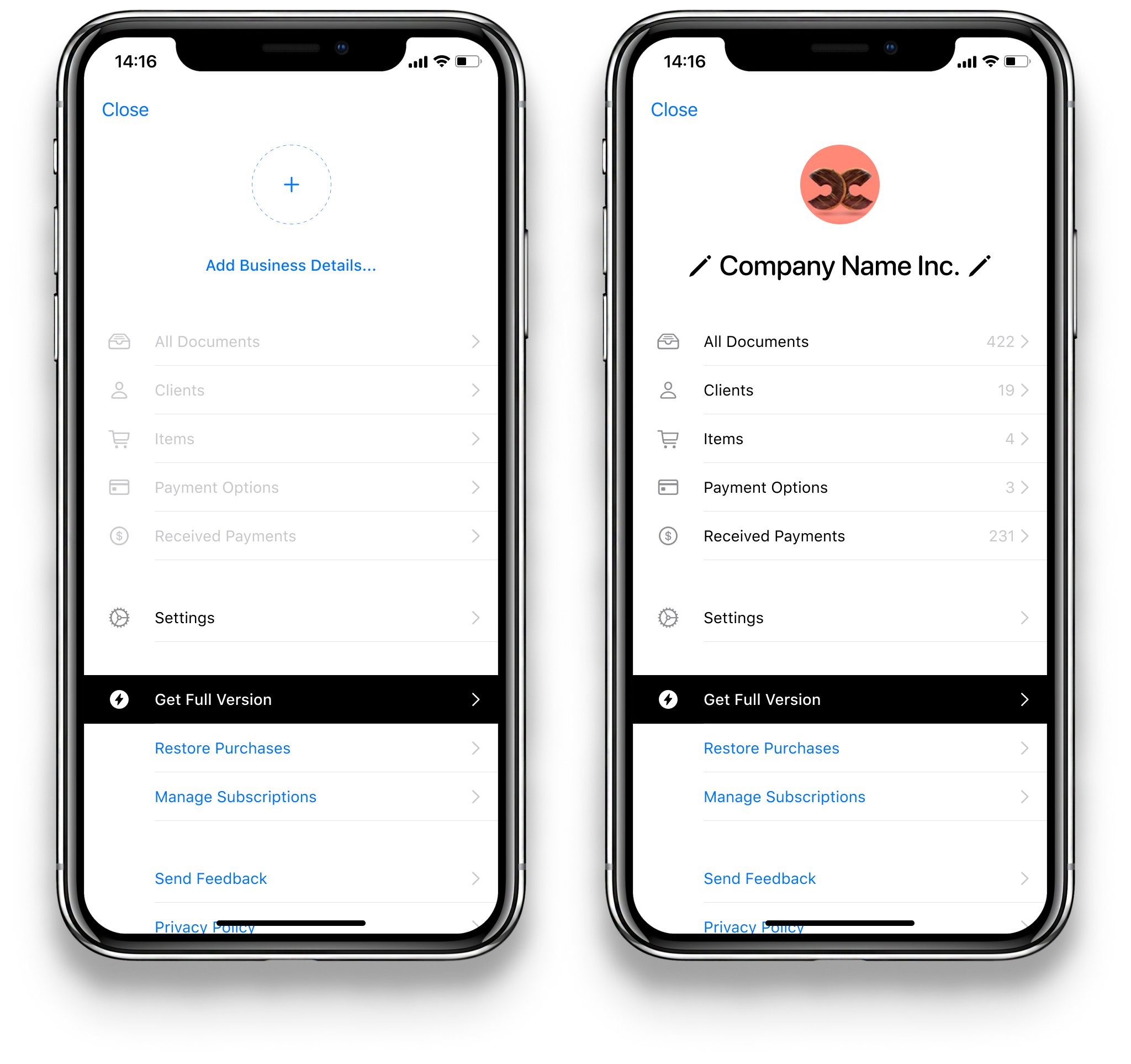
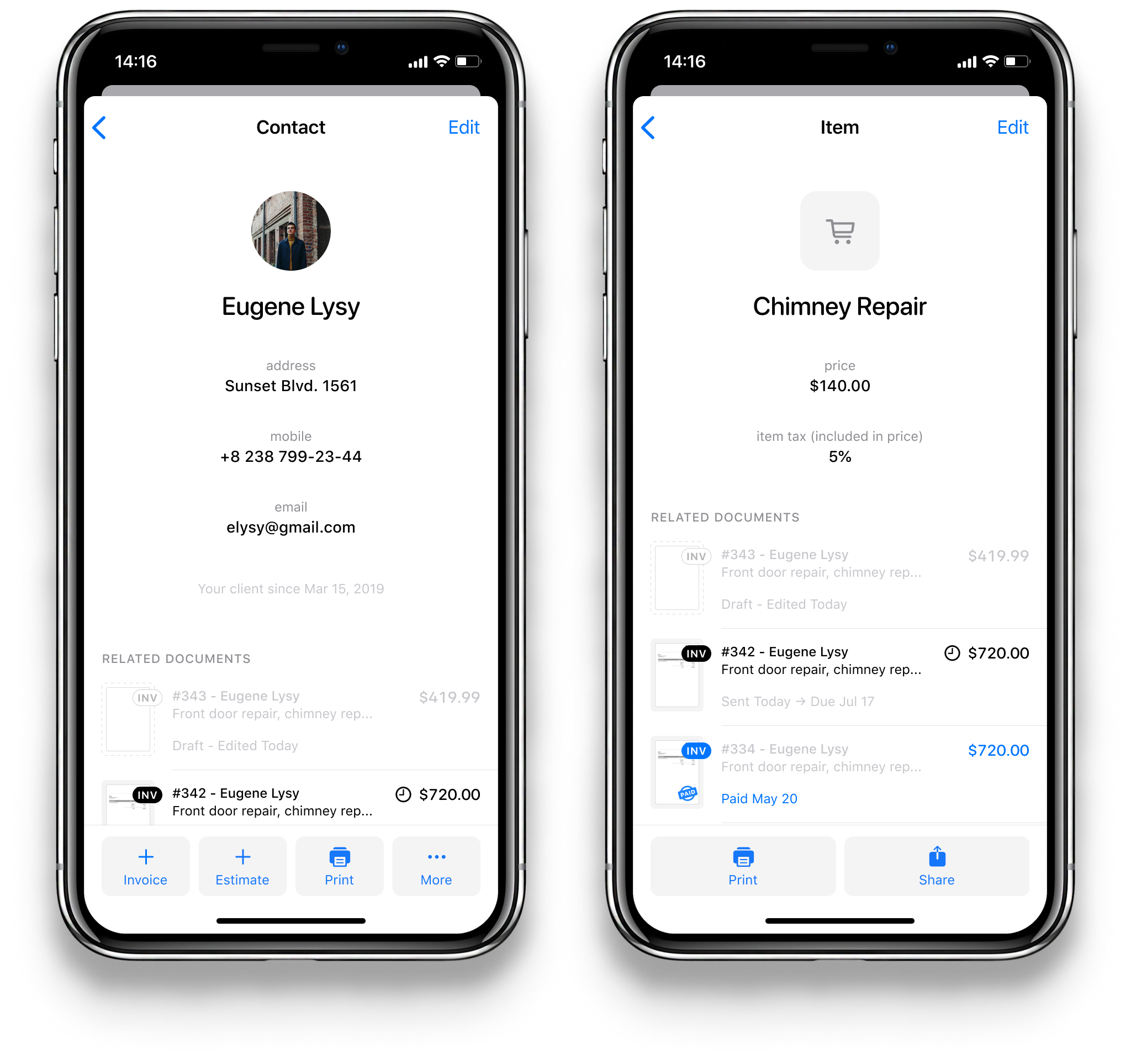
The app provides a handful of angles to view one's data. All the clients, items, and documents are organized:
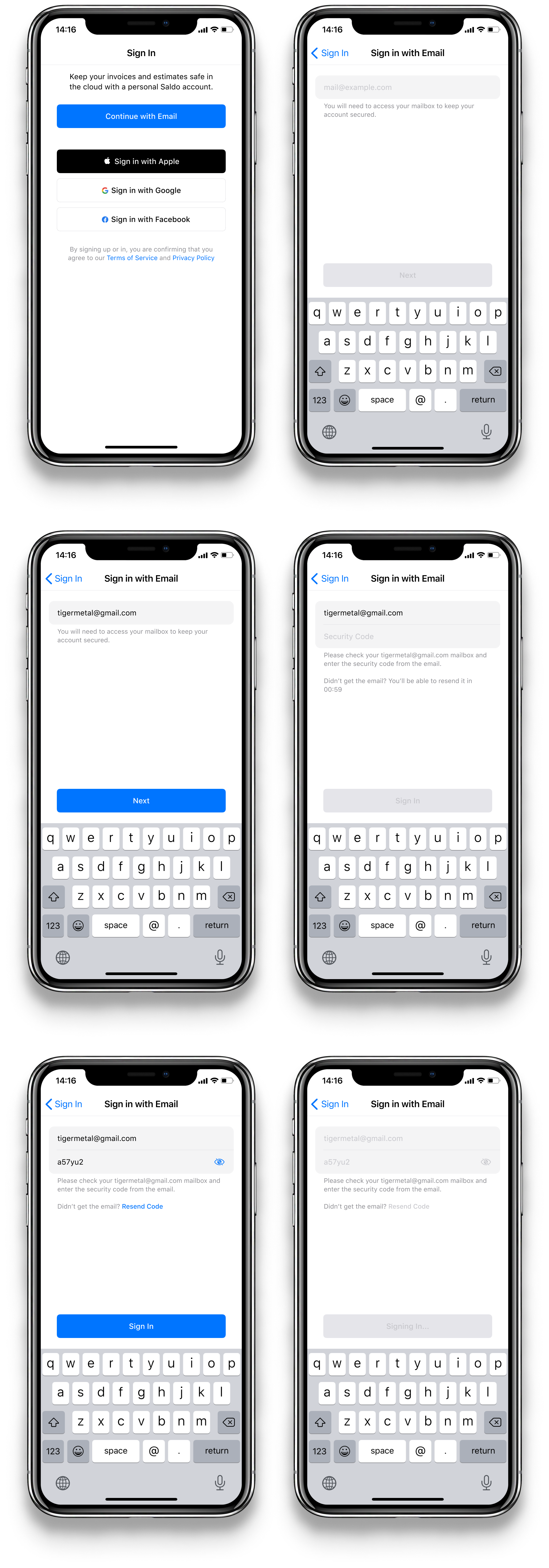
The app's sign in process does not require a password which makes it more secure and easier to sign in:
The “+” button is the entry point to anything the user might be willing to create—an invoice, an estimate, a new client contact, an item to sell, or a new payment method:
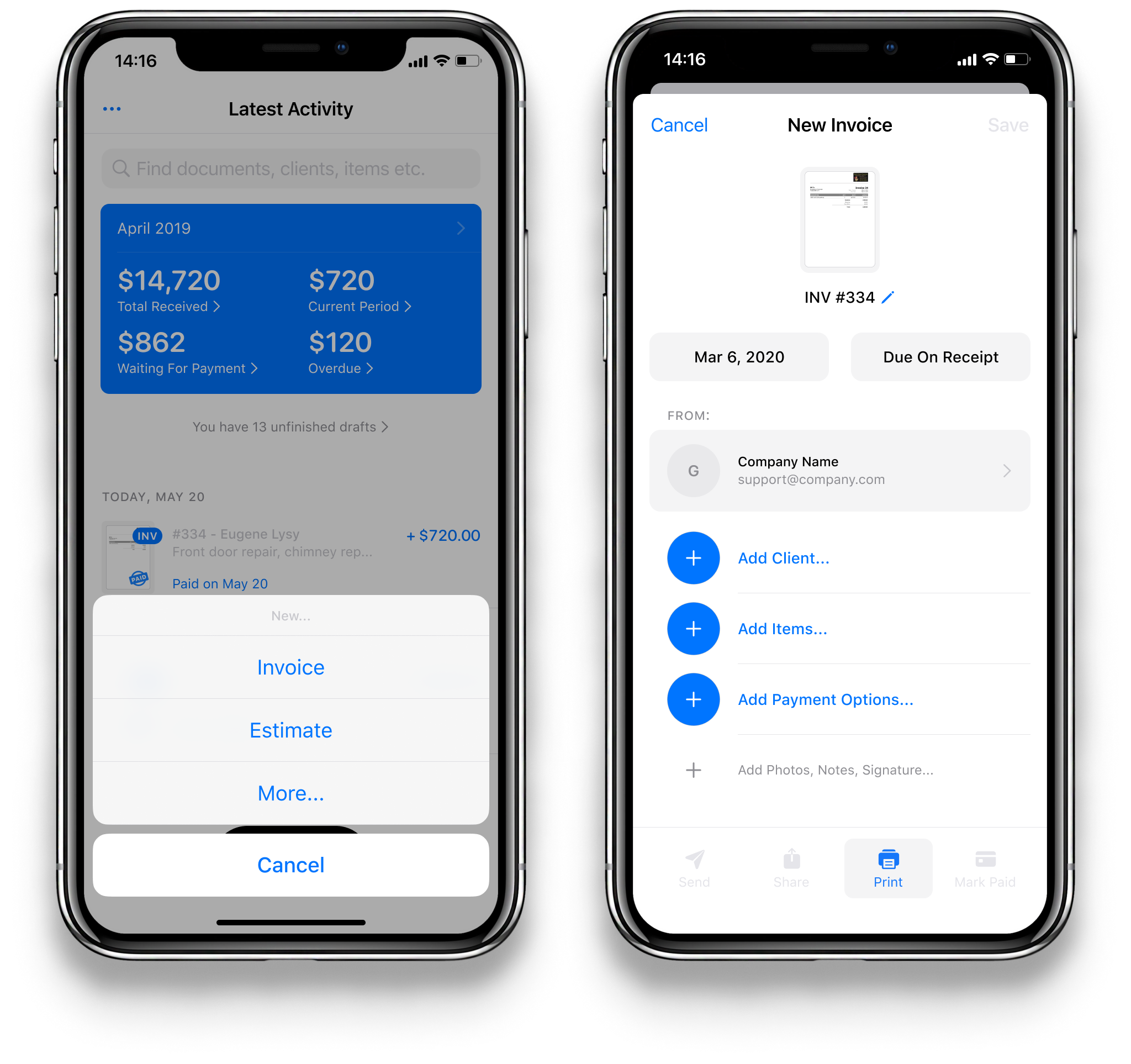
The “New Invoice” screen immediately suggests the user to add the most crusial information of an invoice—the client, the items, and the options to pay.
Additionally, the user might want to add images, a text note, or their signature which they can create right in the app as well.
Here's a more detailed view. This is a partially filled invoice—the big plus indicates that it lacks a client. Once a client is added, the invoice is ready to be sent:
And here is an invoice in its full glory with all the options filled in:
Once created, an invoice travels a certain path towards being paid off:
The app provides a set of organized lists for documents on various stages of their journey:
Once the user has been paid, they add the payment to the app:
Profiles of different entities are designed in a similar way to make it easier to understand the app's design as well as spend less time on developing it:
The app was planned to have a paid subscription model, so a sale screen was designed as well:

Thanks for watching!
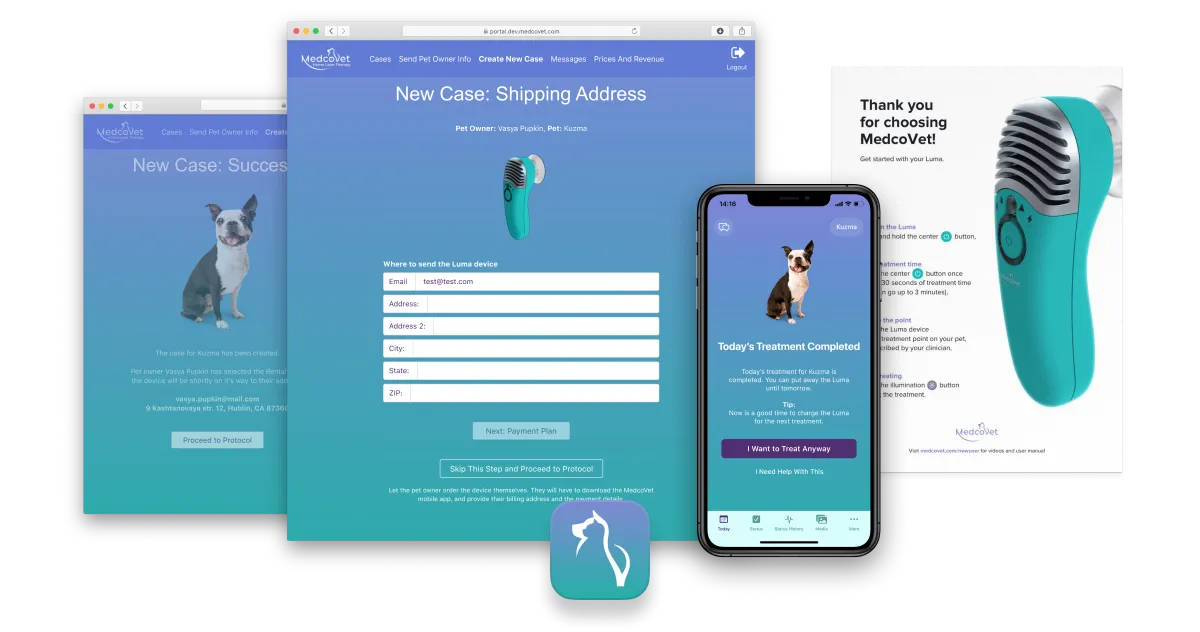
MedcoVet Laser Therapy
MedcoVet are pioneers in home laser therapy for dogs, cats and other pets. With MedcoVet, pet owners treat their pets right at home instead of travelling to clinic 2-3 times a week. This ensures more effective, less stressful treatment, and is cheaper for the owner.
After joining the project, I designed a lot of features for the clinician portal and the satellite mobile app as well as created designs for various non-digital activities.
MedcoVet provides lasers to veterinary clinics, and the clinics prescribe the lasers to the pet owners. The revenue from the prescribed lasers is split between MedcoVet and the clinic.
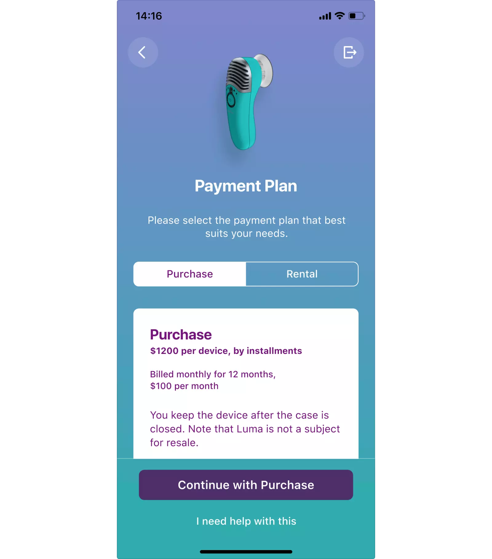
The pet owner makes a choice between two payment plans:
- Rental plan: the pet owner pays weekly rental fee and is to return the device back to the clinic or MedcoVet after the treatment case is closed.
- Purchase plan: the pet owner becomes the owner of the device.
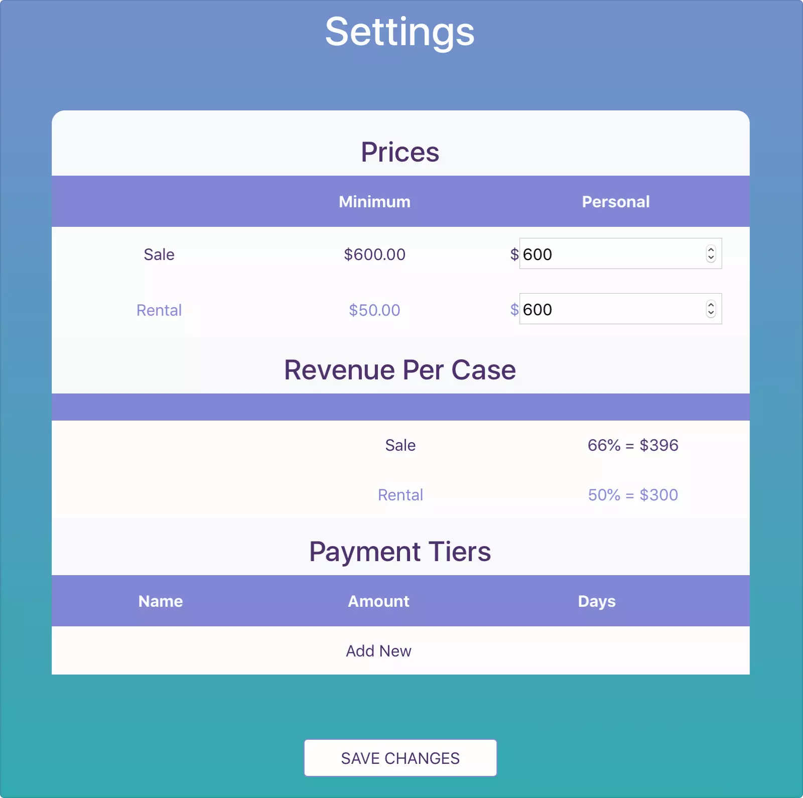
We kept getting feedback from practice owners regarding the complexity of the screen. Some of the practice owners also asked for a flexible price control option, i.e. the ability to make discounts on certain weeks. So, we decided to redesign the screen.
The core idea was to clearly divide the two plans and their prices, and improve the rental price customization interface. I also wanted the practice owner to be able to see the clinic potential revenue calculation, so they could make better pricing decisions:
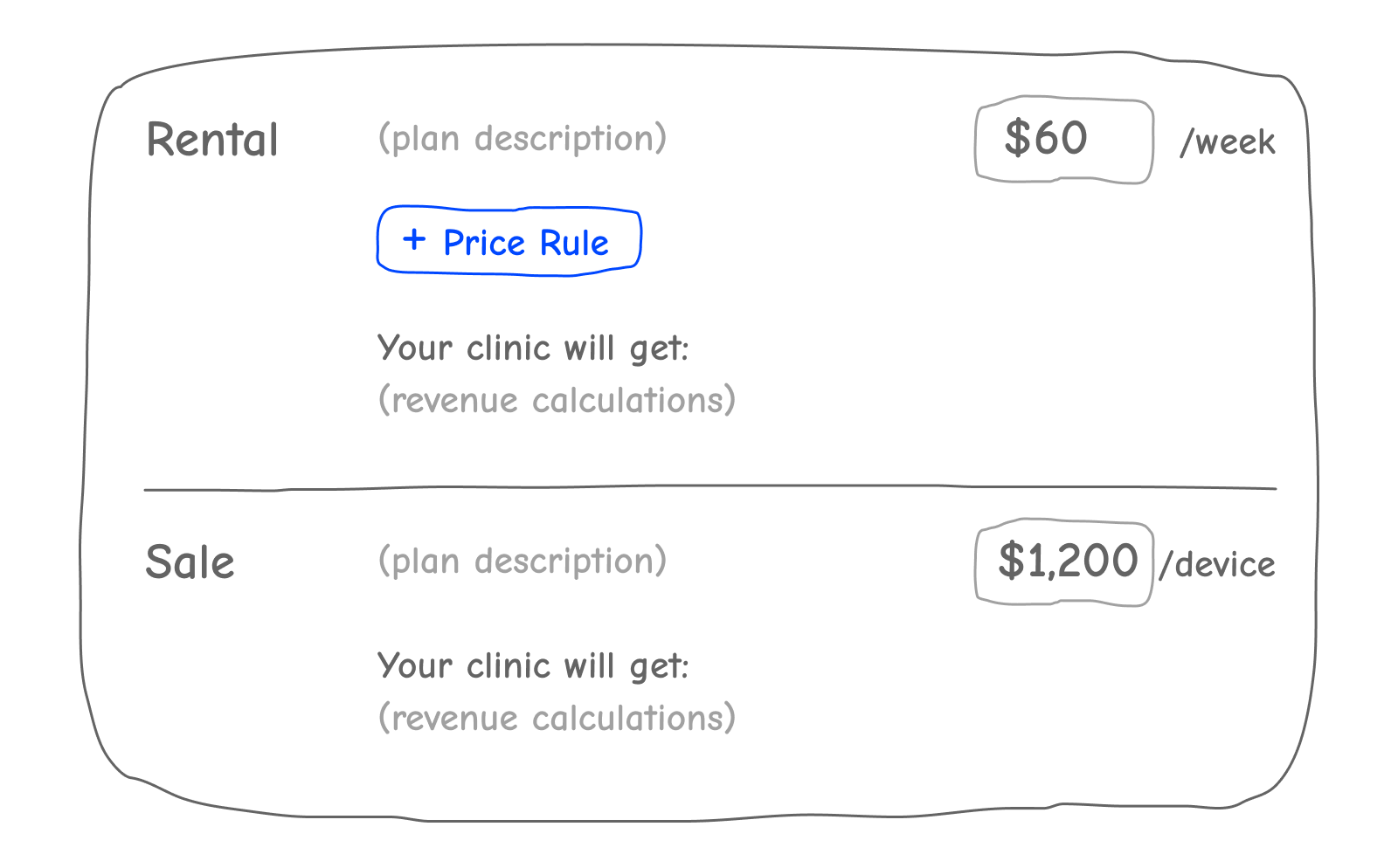
A price rule has been added:

Here’s how it looks in the UI:

The practice owner can see the potential revenue the clinic is going to get by renting or selling a device.
When a price rule is added, it gets the previous week’s price by default, so the tables won’t recalculate until the price is changed:
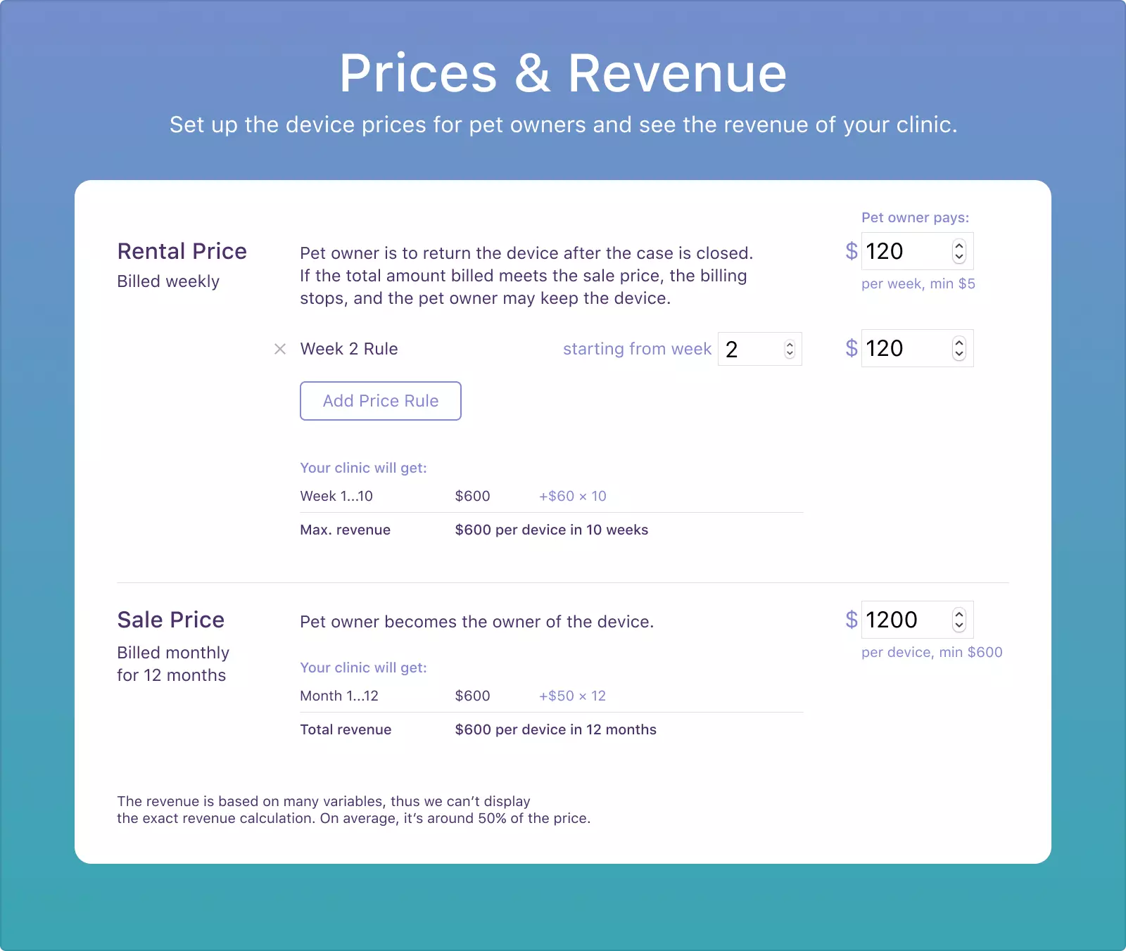
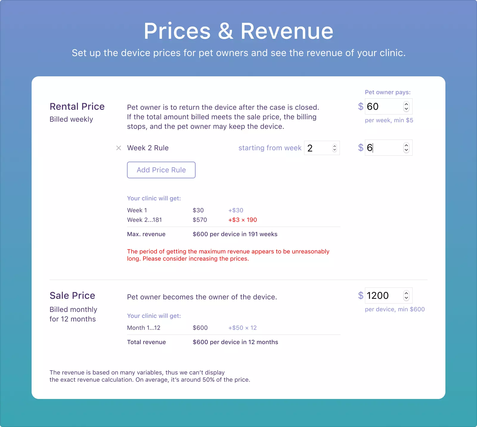
When the practice owner changes one of the prices, the revenue tables immediately recalculate the clinic’s income. If the first week price is reduced to $60...
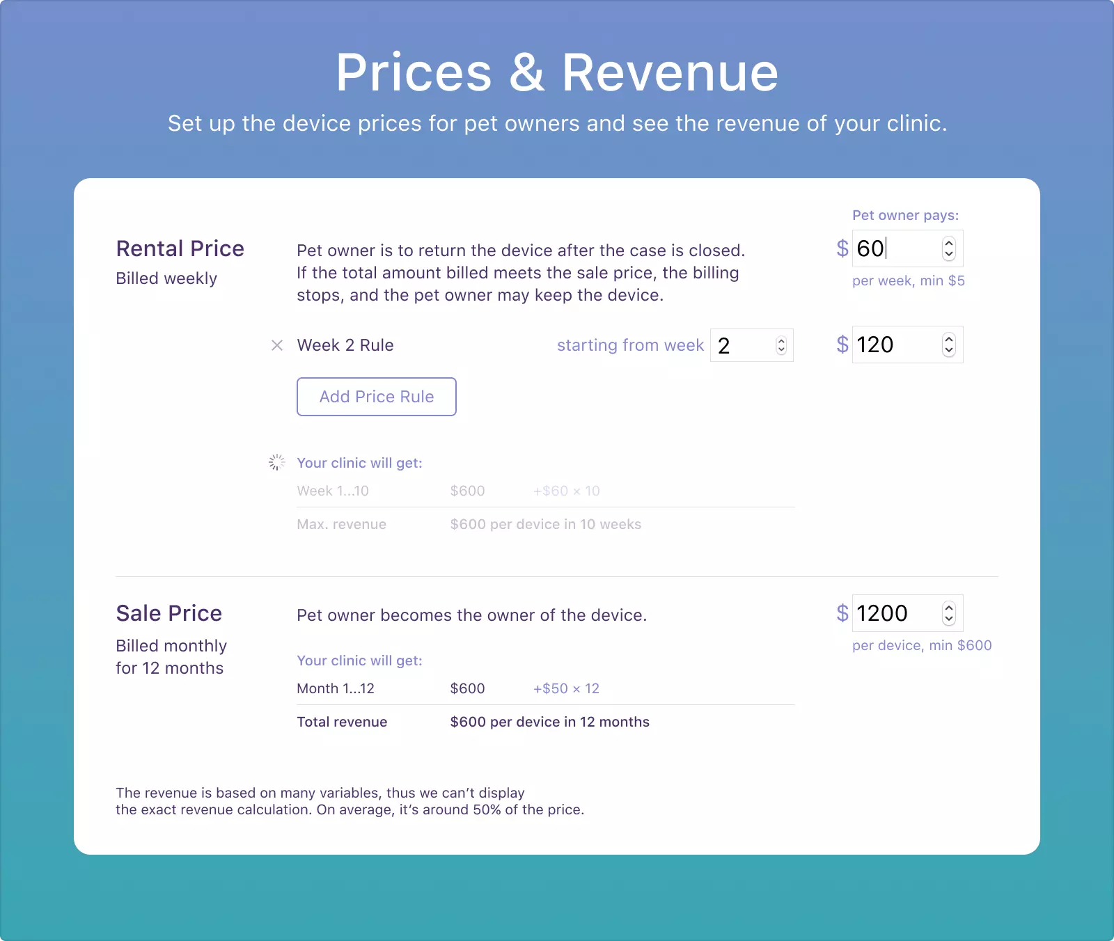
...the table will update the revenue numbers:
The recalculaton happens with a small delay to be sure it won’t happen while the user is editing the prices.
There is no limit to the number of price rules. The rule titles and the clinic revenue table are automatically updated according to the added rules:
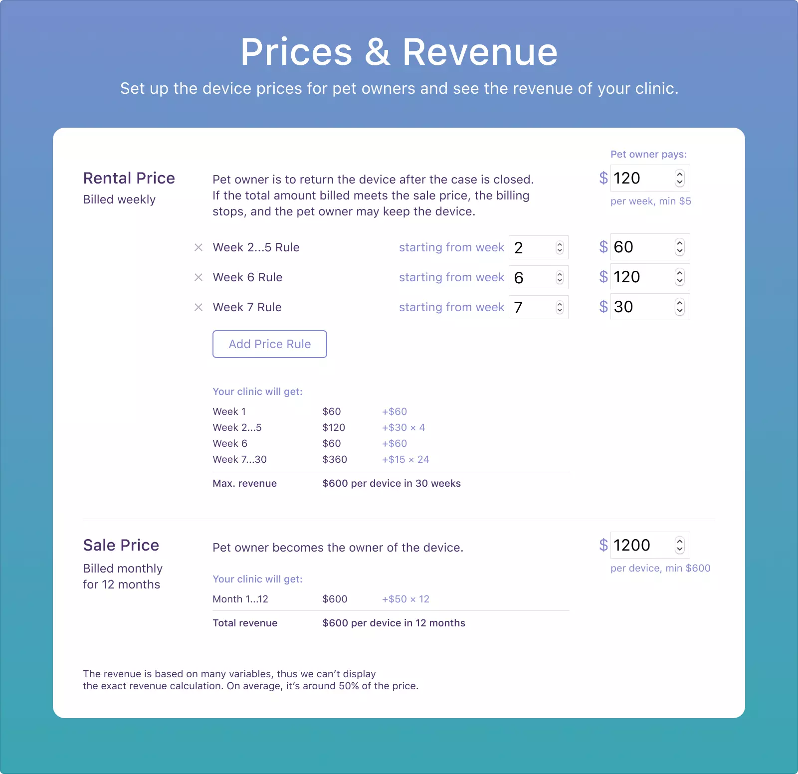
We also implemented some under-the-hood scripts that prevent setting a week number that is lower than the previous one, or a price that is lower than the allowed minimum. The dedicated textfield will change the entered information to the nearest valid value.
The interface also encourages the practice owner to avoid unreasonable pricing:
The clinic's price policies are then displayed for the pet owner in the MedcoVet satellite app:

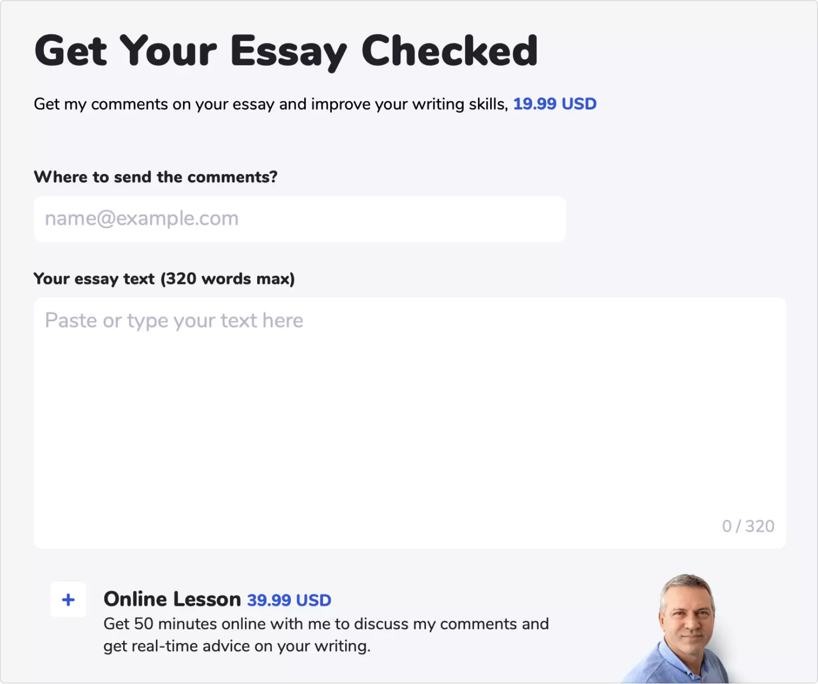
EssayTuition.pro
EssayTuition was my dad Alexander's personal website. He offers systematic improvement in essay writing skills for students and other people keen to perfect their English.
I designed the website including the copy, managed the development and negotiated the billing system connection with the provider.
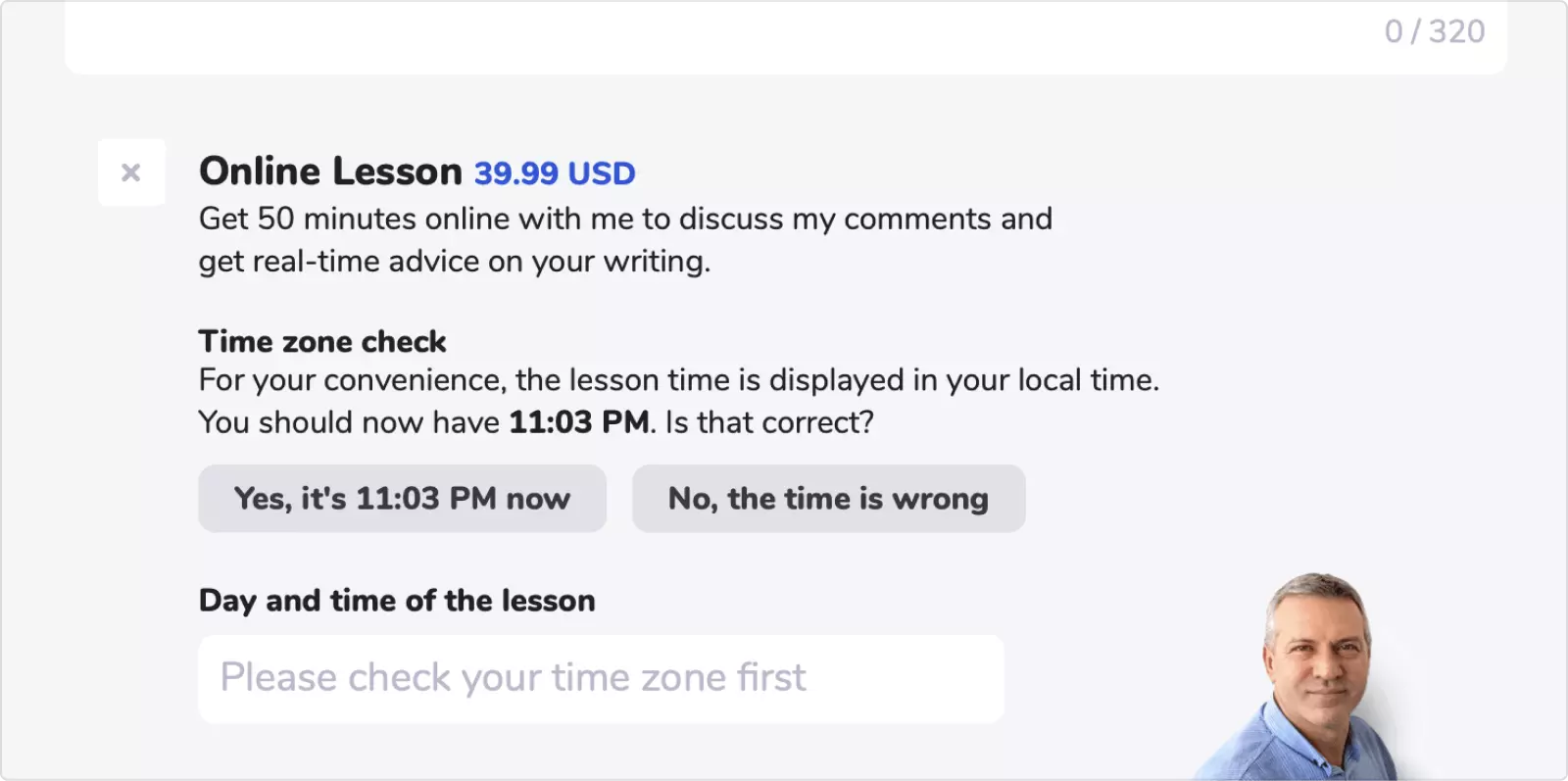
At the bottom of the site, there is a form for submitting the essay text. The student may also decide to book an online class in addition to the offline check to discuss the comments online:
The problem was that the student might be anywhere in the world and have any time zone, so my father had to negotiate the lesson time with each student by email. It would often take 2-3 emails and several days to have the lesson booked.
It's much easier to work with the lesson schedule when the student's time zone is known. I decided that the best way to define the time zone is to guess the student’s local time and adjust the schedule accordingly:
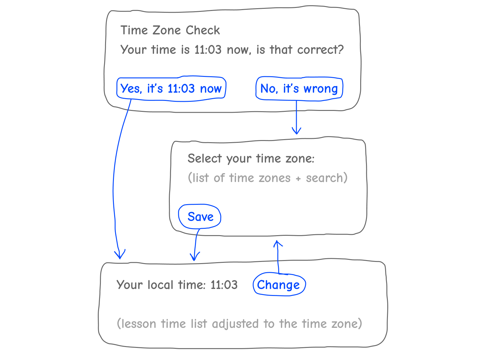
And here's how it's done in the interface:
If the guess is good, the student selects “yes” and immediately sees the lesson schedule:
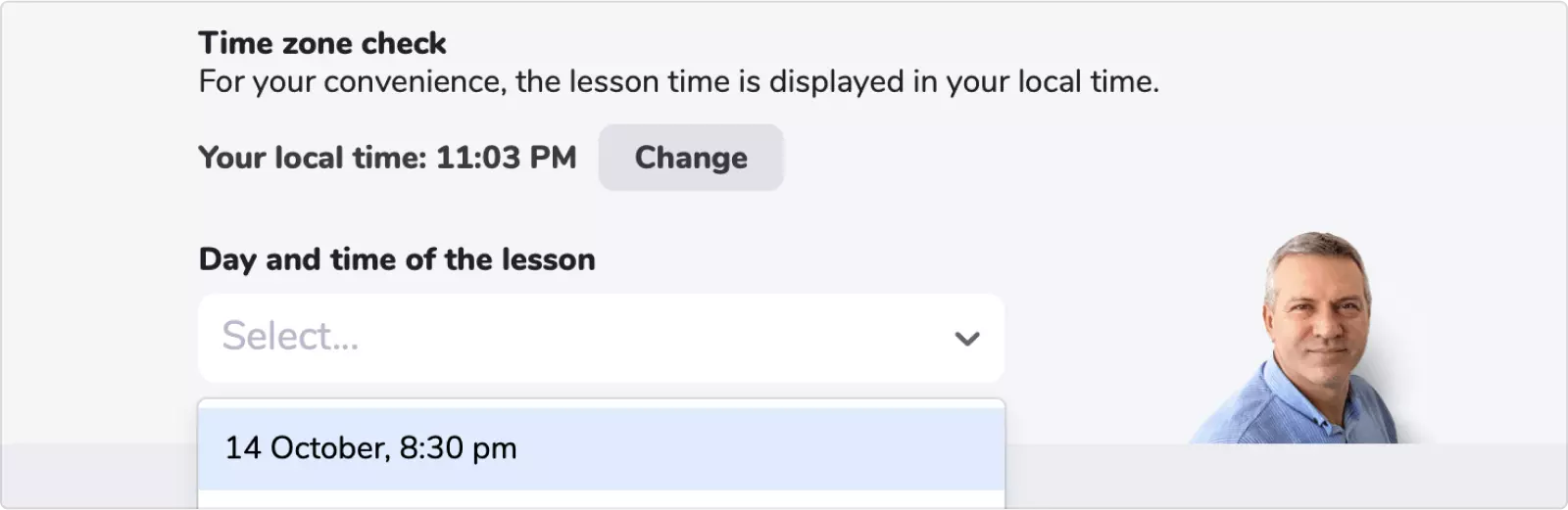
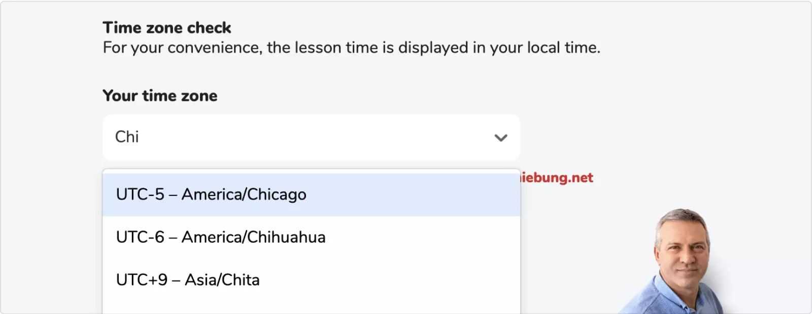
The site tries to guess the student’s local time by their IP and browser language settings. the method is not very reliable, so there must be a backup plan.
If the time is incorrect, the website prompts to specify their time zone. It’s not as simple as saying “yes”, but is still better than negotiation by email:
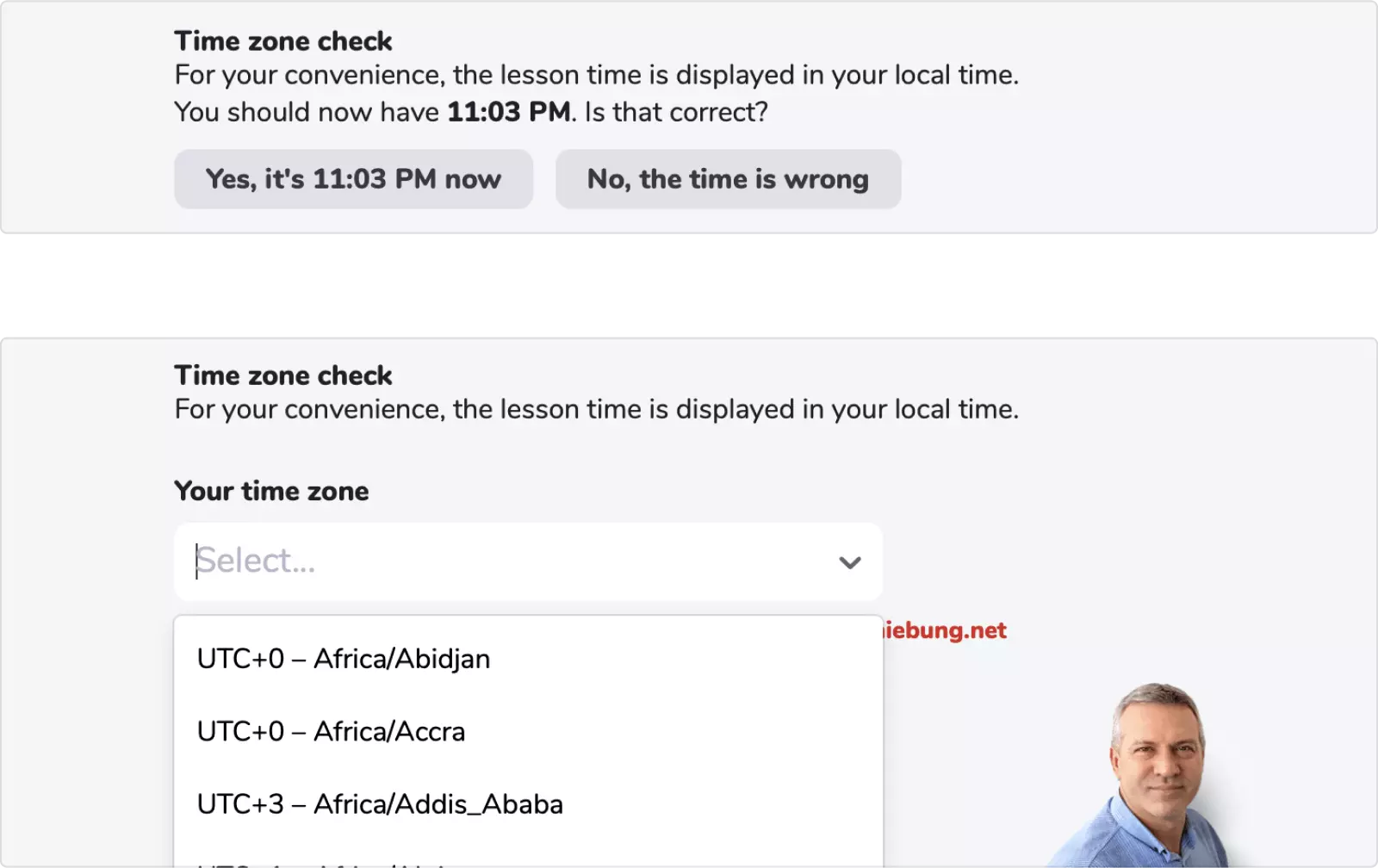
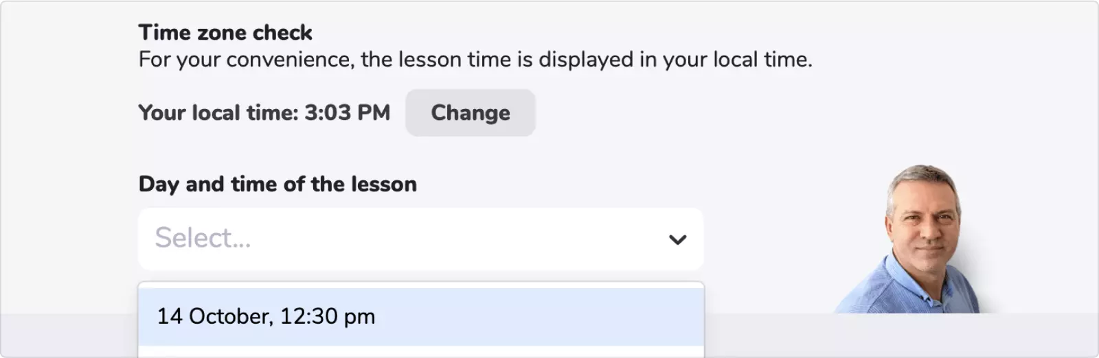
Let’s try to choose Chicago...
...and see that the lesson time in the schedule has changed from 8:30 PM to 12:30 PM:
And for last: the time schedule can be edited through Google calendar. To add or remove a lesson time, my father just opens his calendar, makes the changes, and the schedule is instantly updated.
We plan to add more automation by excluding the booked lesson time from the schedule. But that’s a story for another day.
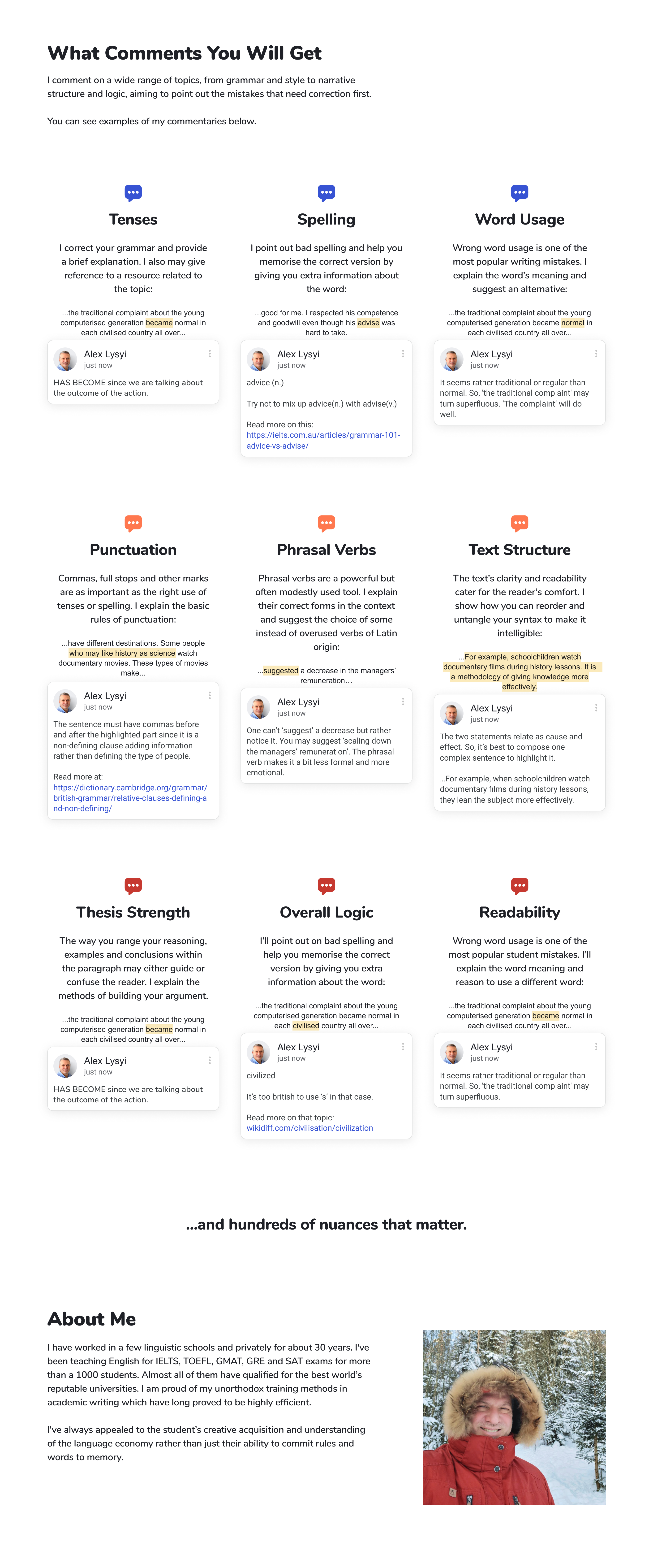
The Comment Type section was designed to show the versatility of my father's comments:
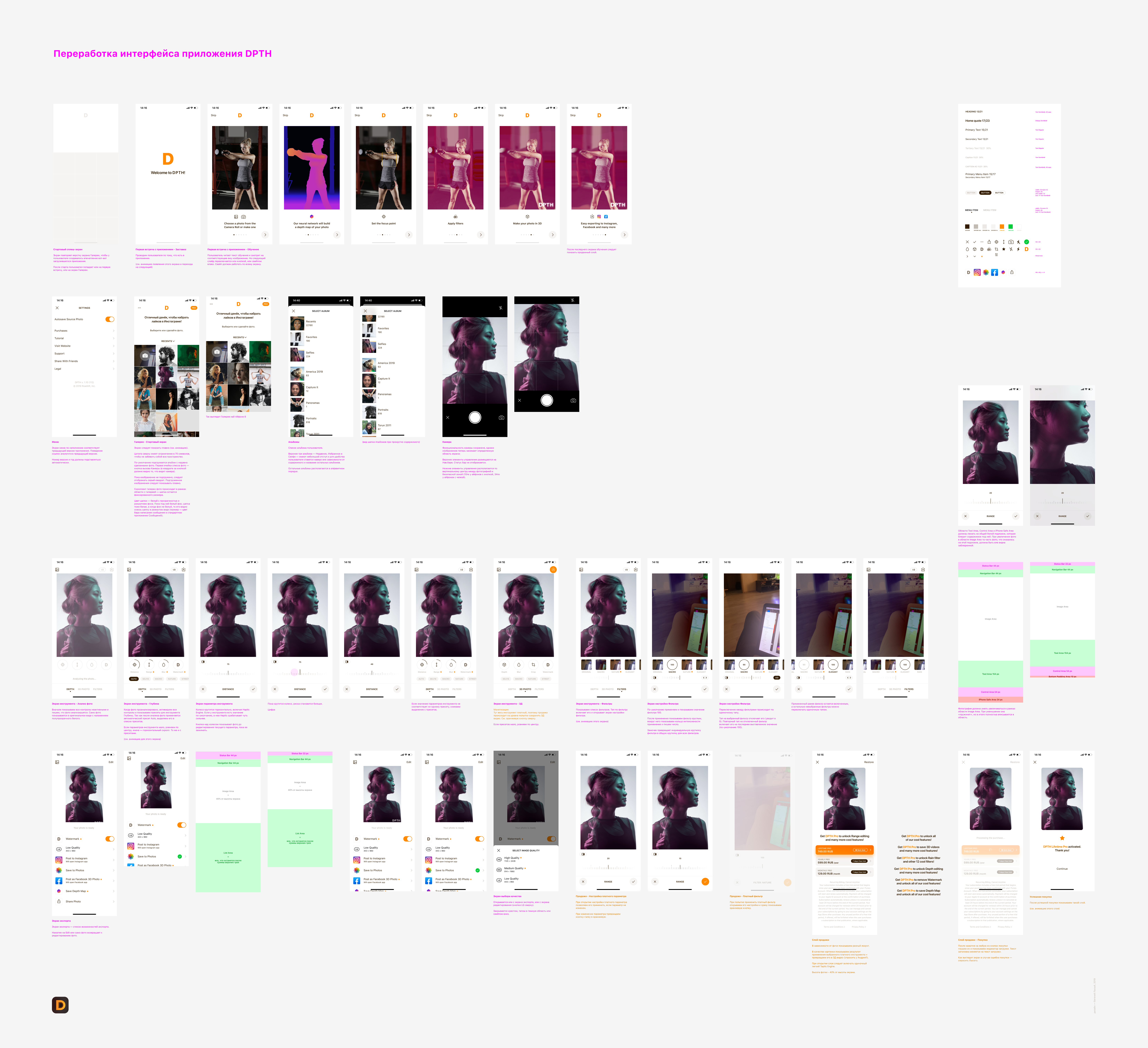
DPTH 3D Photo Editor
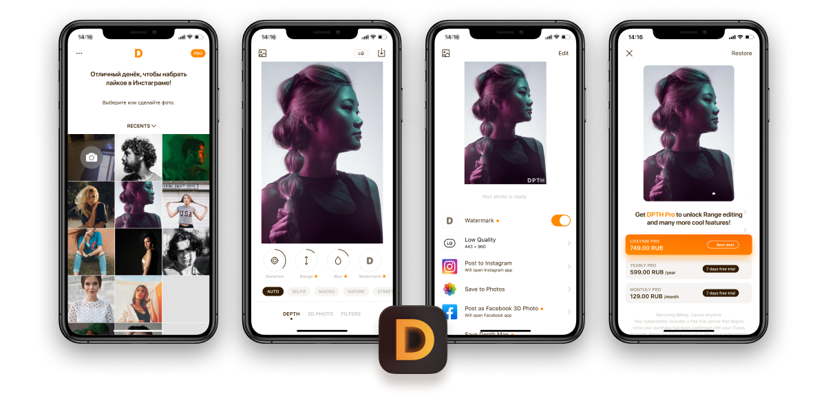
DPTH Photo Editor by Roadly Inc. is an AI-powered depth-of-field photo editor. In other words, you can make any regular photo look like it's been made on a professional camera with the depth effect.
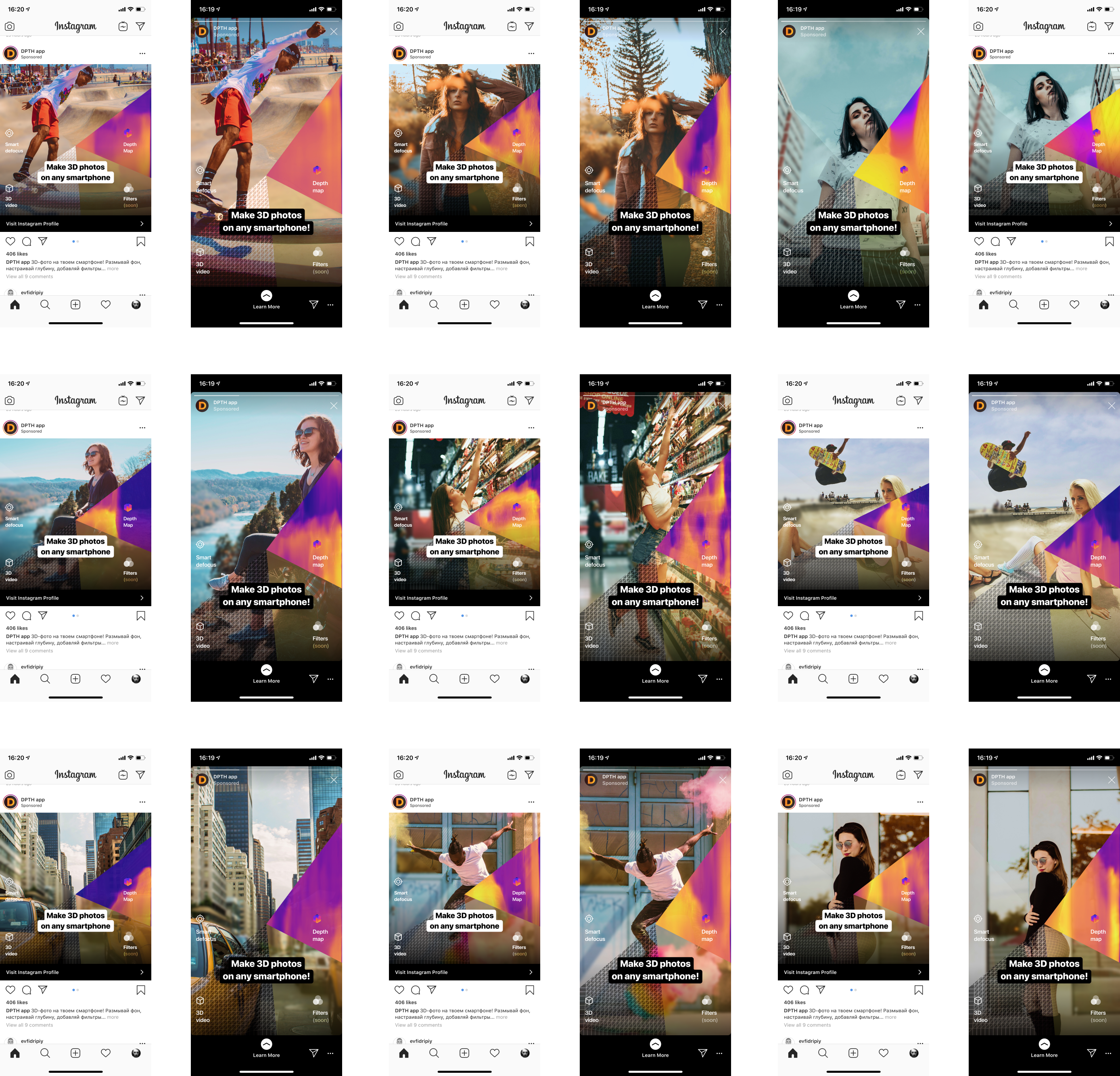
I redesigned the iOS app and helped with the company's advertisement campaigns in Instagram.
Zoom in the page to see the details:
I designed a format that would be eye-catching and show the main features of the app all at once:
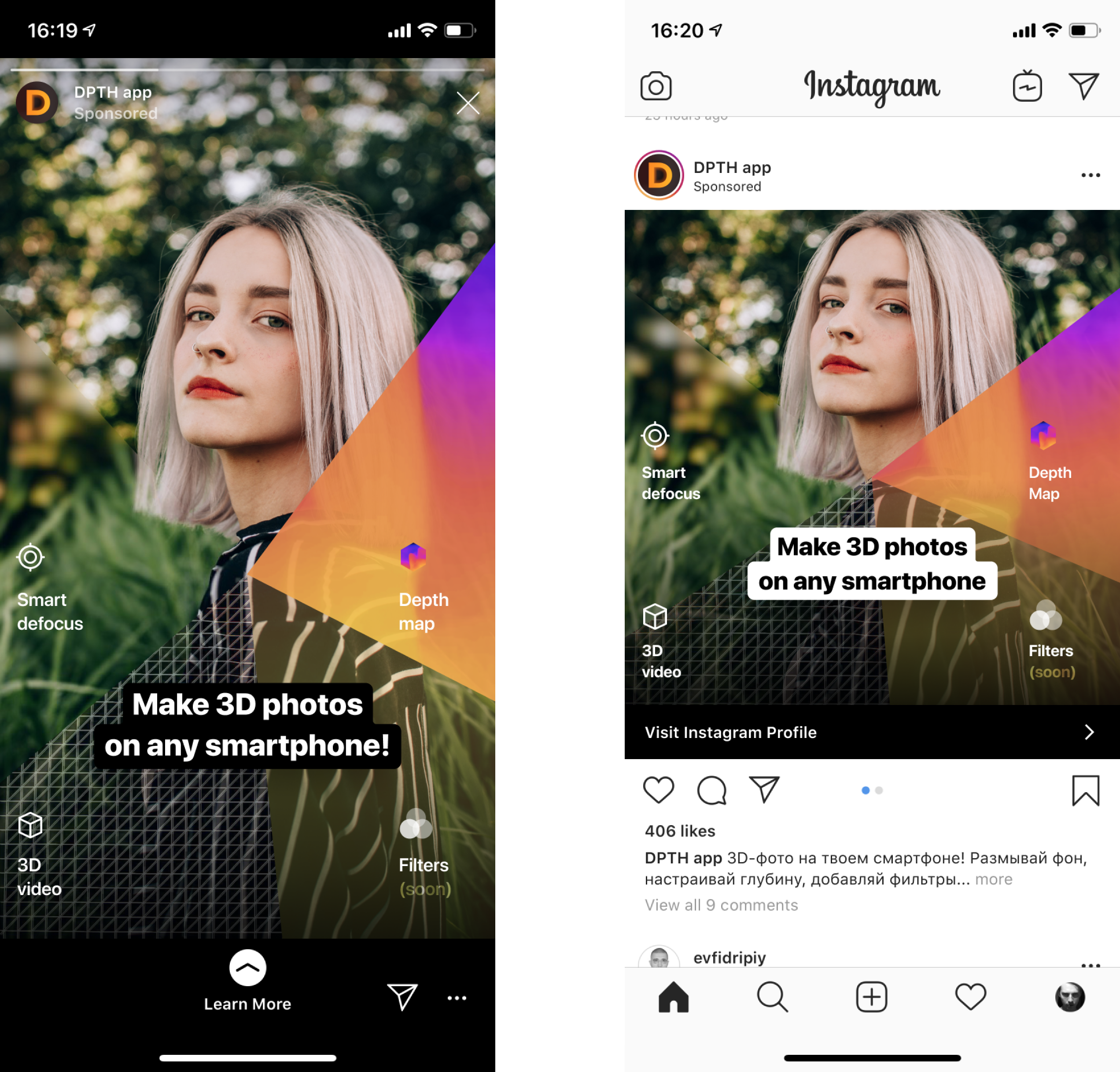
The design allowed to create different variations of the ad in different languages to experiment with conversion:
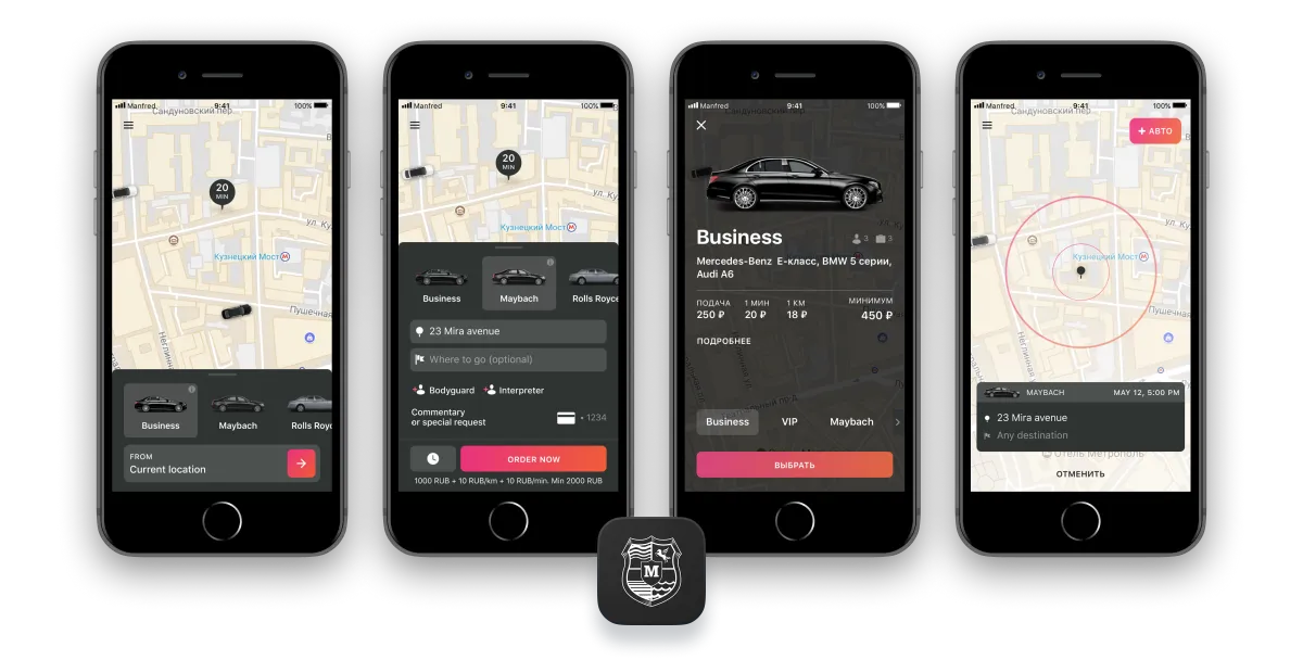
Manfred
Manfred is a premium taxi service that allows to order a Maybach, Rolls-Royce, Bentley, a premium sports car, or even a private jet. To the customer's taste, any order can be complemented with a personal assistant, a bodyguard, and an interpreter.
I redesigned some of the existing features as well as designed some of the new ones based on the app's current design.
MelodiQ
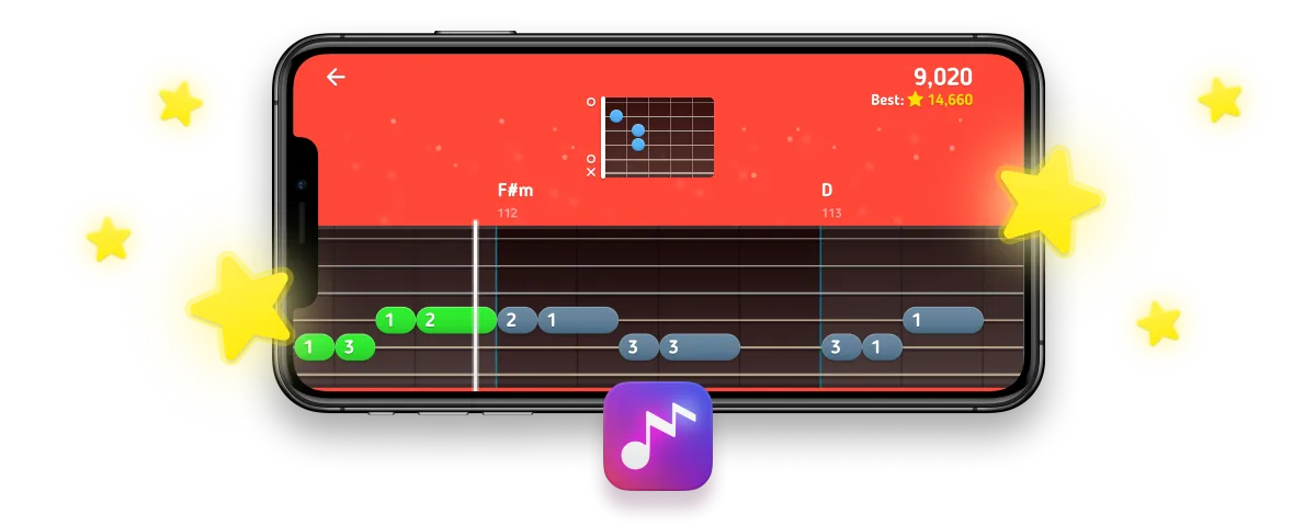
MelodiQ is an interactive guitar tutor for beginners with game-like experience. It consists of tutorial videos, interactive lessons, and songs. When you play, the appprovides instant feedback on your playing and adapts the content to match your skills.
I created the design system of the app as well as all the screens, designed all the features, wrote the copy and created the app's built-in guitar lessons.
Here's a demonstration of the app's main features that we made for Apple's App Store review team:
These are some examples of the guitar lessons that I created for the app.
For every lesson, I pulled the theoretical data, developed the tuition method, wrote the copy, created the script, ordered and managed the narration voice, directed the video production, and made the post-production editing.
Holding a guitar
Playing frets
Using the in-app tuner
Remembering chords with ease
Learning 5 basic chord shapes
Switching between the A and D chord shapes using the anchor finger technique
The application provides instand feedback to the user's playing. For the algorithms to work well and the feedback to be honest, the guitar must be tuned. Besides that, many users had send us complains about the assessment algorithm, and we realised that most of them simply had not tune their guitar before playing. We decided that the app needed a built-in tuner.
Since our users were mostly beginners, the tuner had to be easy to use and motivative, so the user would tune all the strings.
The tuner is one of the basic guitar gear, and it seemed like there was no reason to reinvent the wheel. However, the popular tuner apps at that time looked like this:

Most of the tuners were instantly repelling because of their complexity. Some of the apps looked better than others but required music theory knowledge or forced to select a string each to tune it up. None of the tuners motivated the user to complete the tuning.
I tried to eliminate all the shortcomings and came up to this concept:
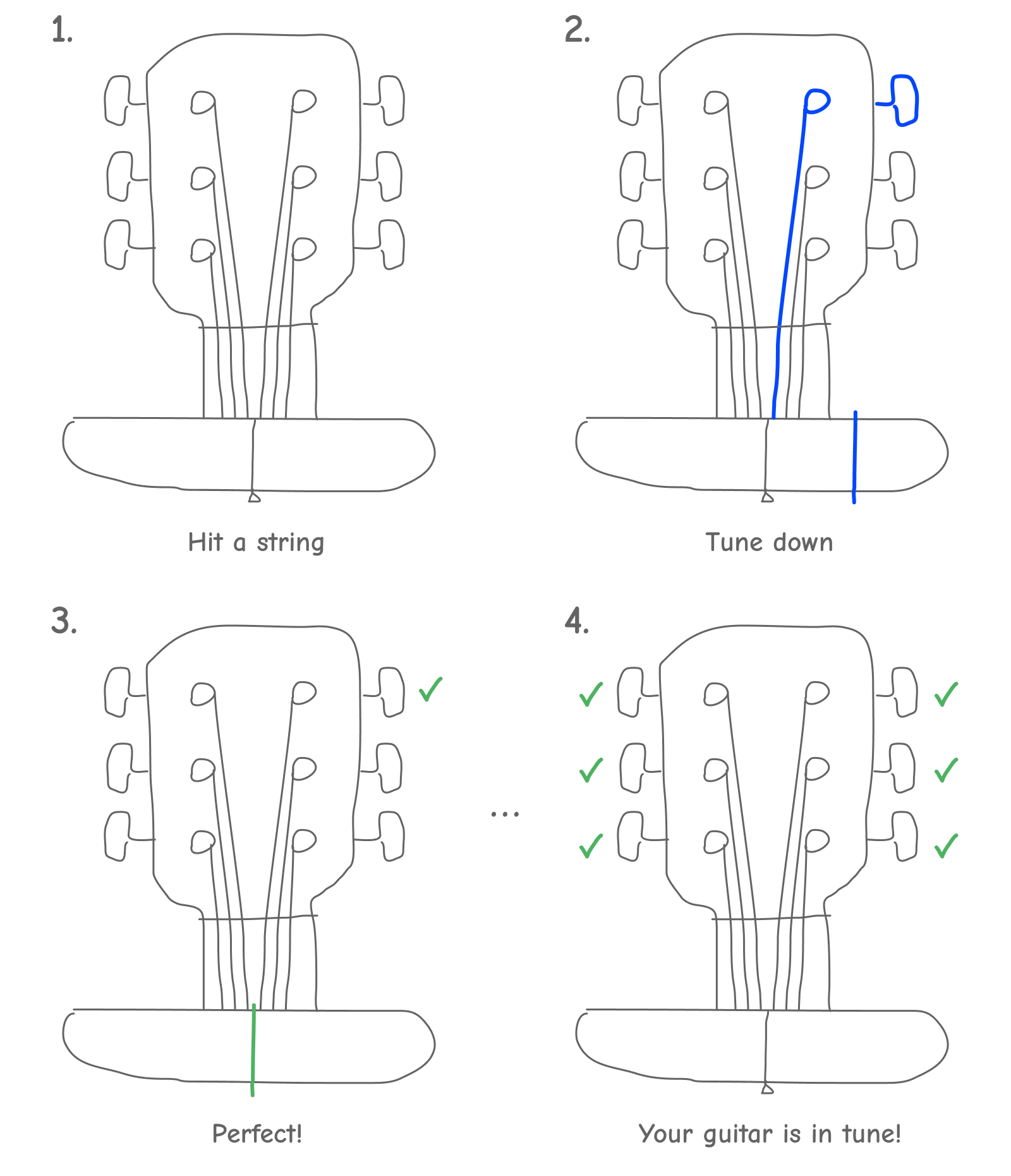
The main idea was that when the user played any string, the tuner would automatically detect which string had been played and suggest if it's needed to tune it up or down. When the string was in tune, the tuner would mark it as tuned. The marks created a gestalt that were to motivate the user to collect all the marks, i.e. tune all the strings.
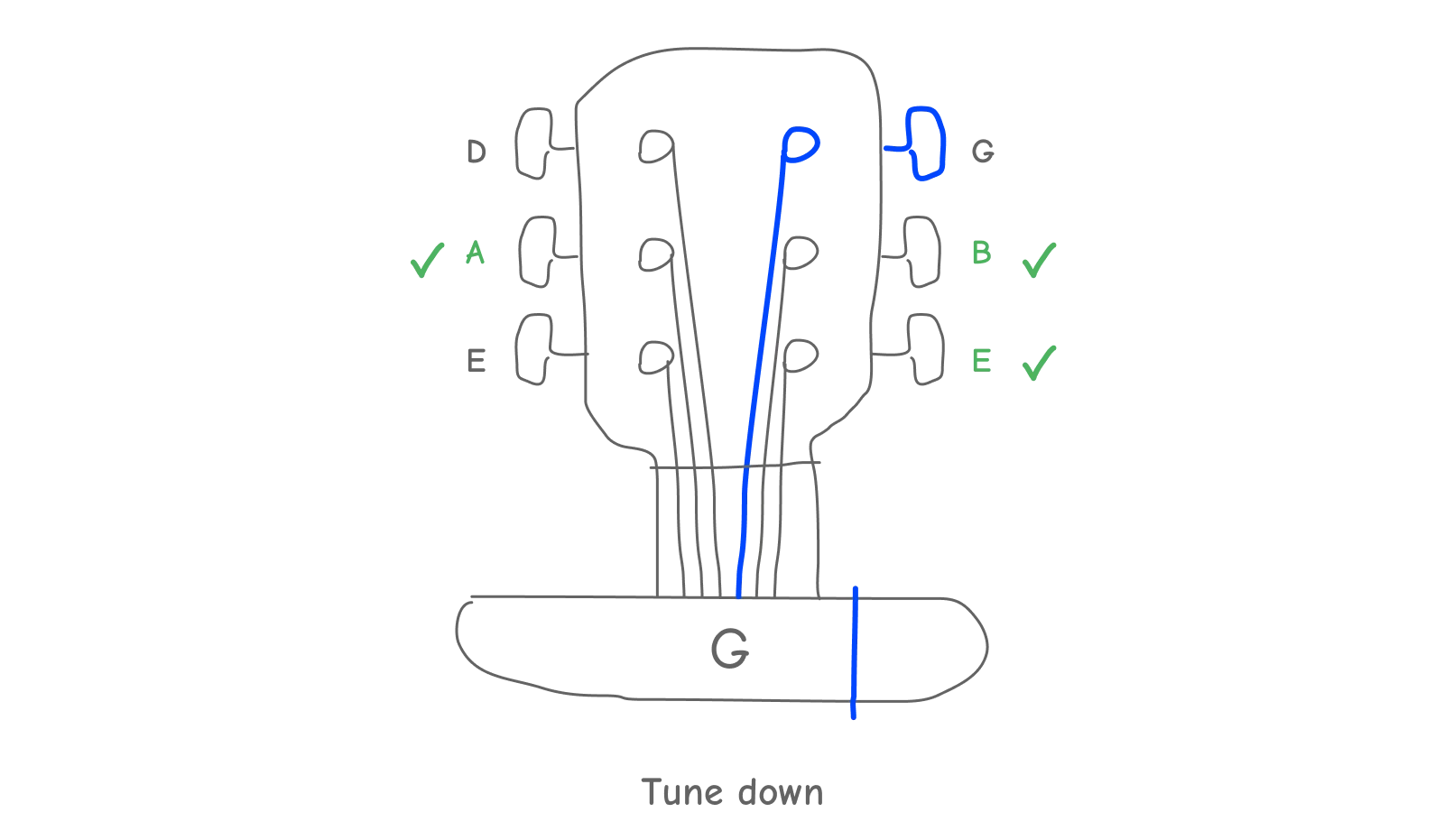
Later the team decided that we needed the user to learn the notes of the strings. We put them in such a way that the notes wouldn't prevent the user from using the tuner but at the same time would help the user associate strings with their corresponding notes.
Here is how it looks in the interface. It all starts with a suggestion to play a string:
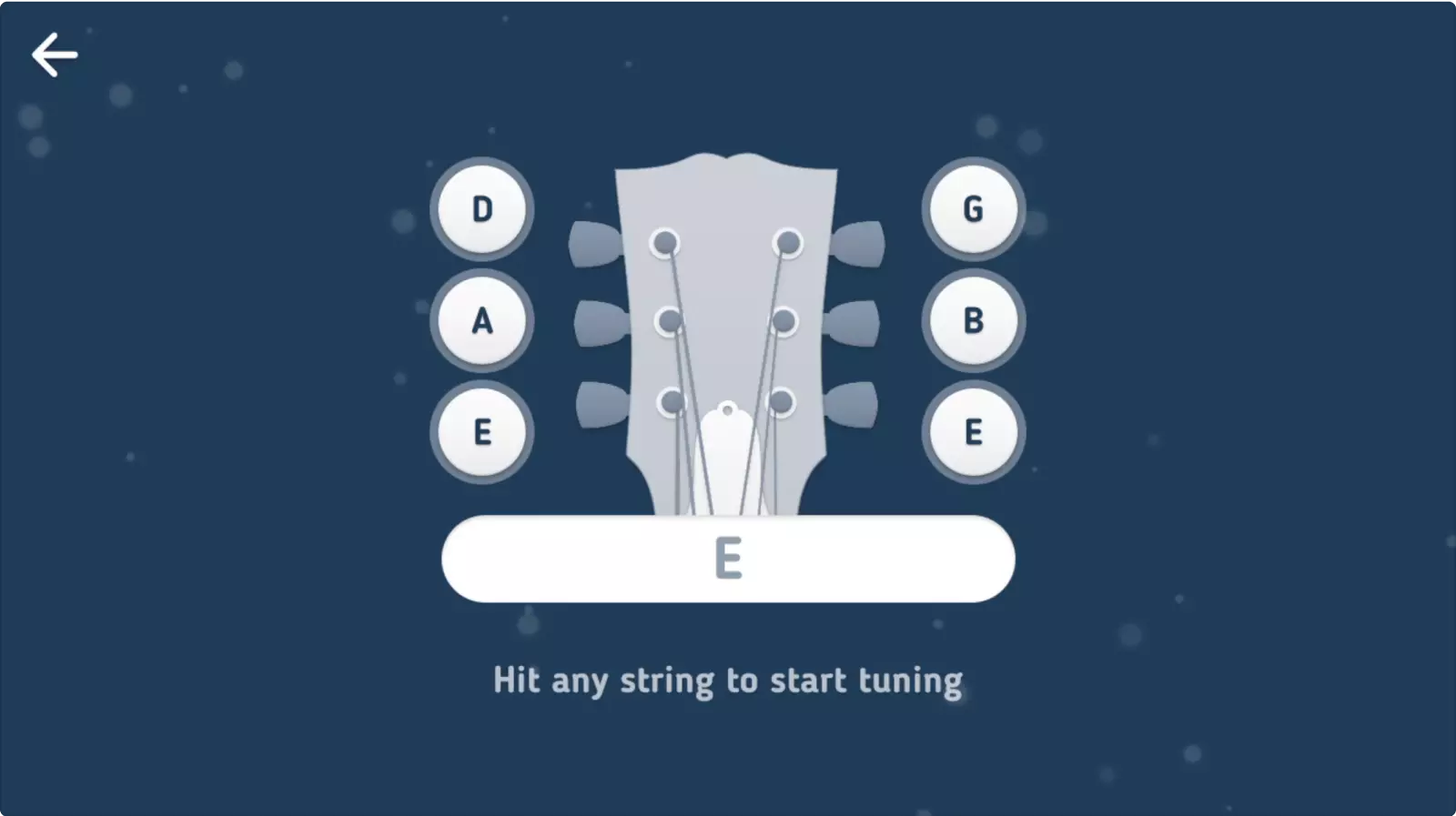
The tuner automatically determines which string has been played— we compare the frequency ranges of each string with what the user plays:
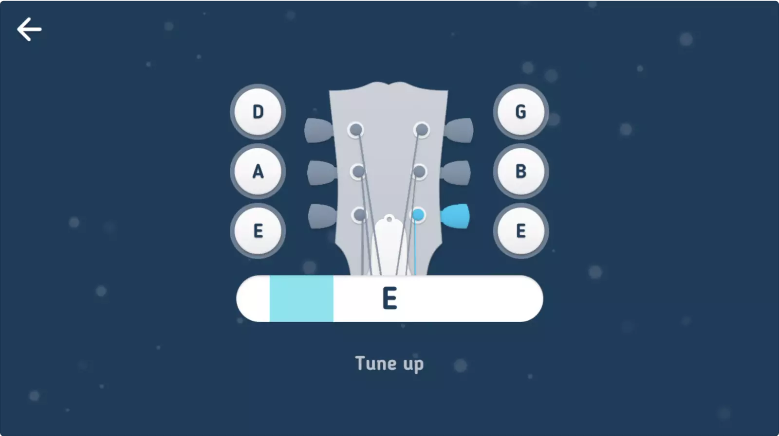
When the string is almost in tune, we slightly change the message, so the user would tune with more caution:
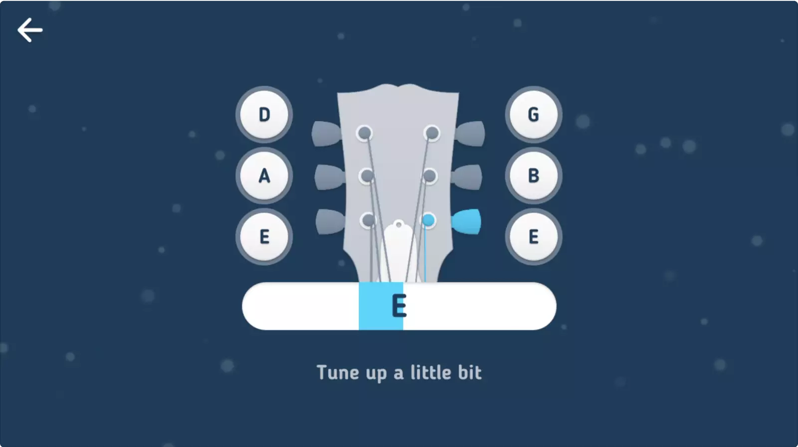
If we hear the correct pitch, we ask the user to let the string ring for a while: right after the stroke string usually sounds higher, and the tuner may mistakenly decide it's already in tune.
That's why we don't just follow the pitch one moment at a time, but rather accumulate the correct pitches to make sure that it's not the peak:
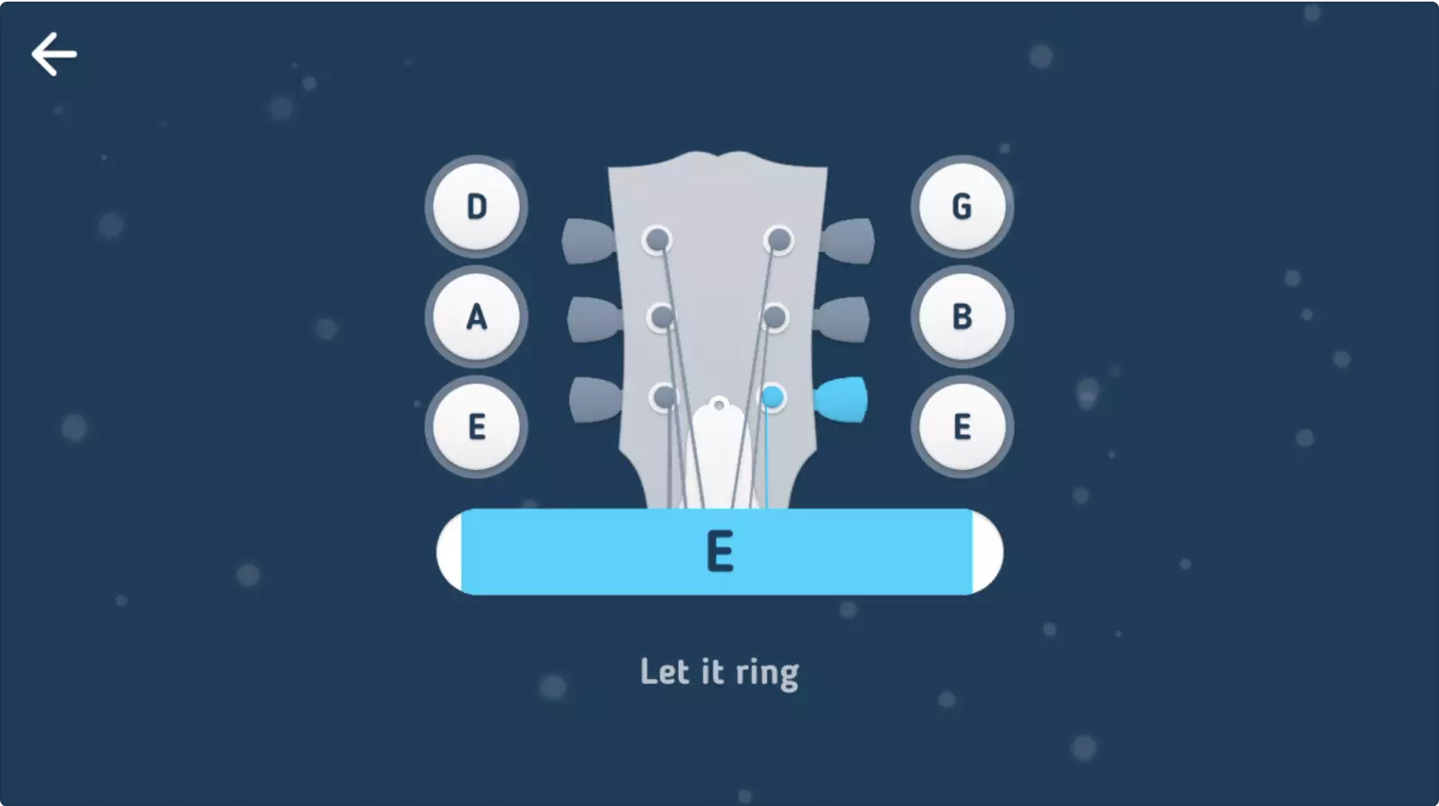
The string has been tuned:

The strings can be played and tuned in any order. When the last string is tuned...
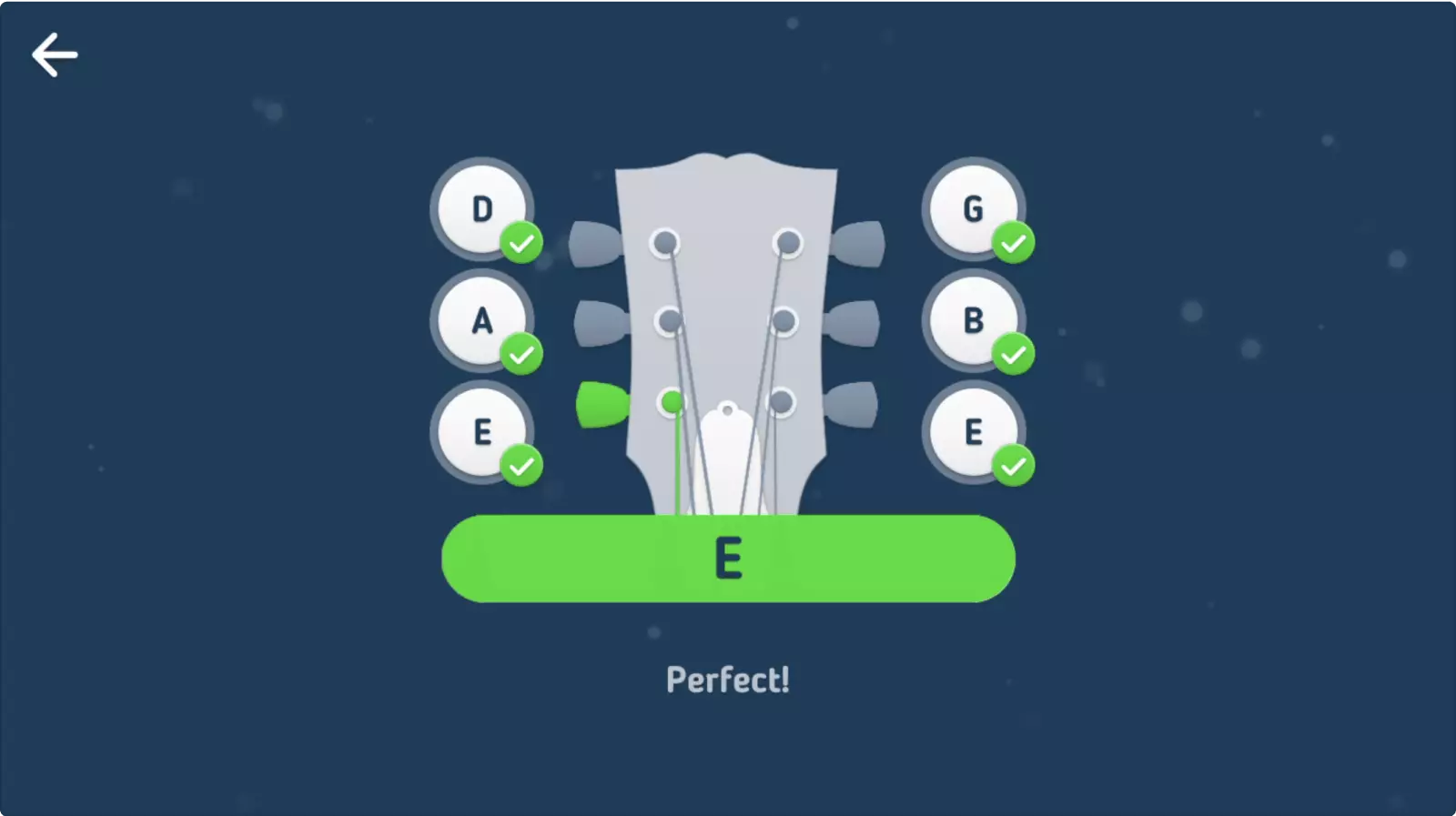
...the tuner announces that the guitar is in tune.
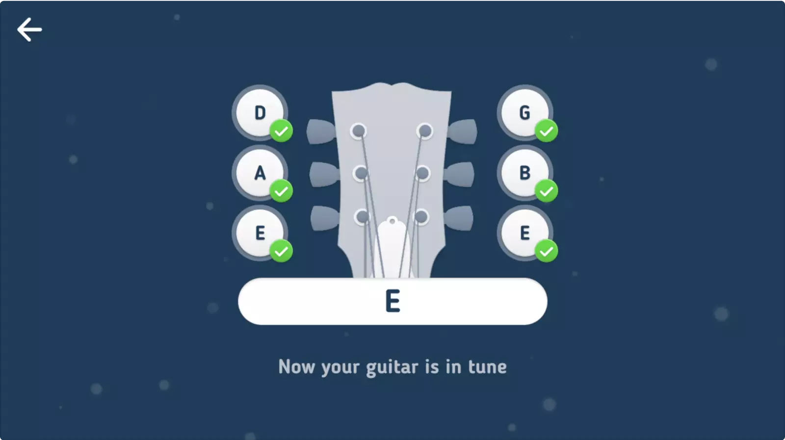
Now the user can begin the next lesson or practice a favorite song.
See the tuner in action (0:06—0:26):
Personal Project
Pixelfont
This font is just 5 pixels tall! It works great for tiny LED screens, oldschool videogames, a gaming website, or as a fancy styling.
I made this extra small pixel font as a design challenge. If you use Pixelfont in your project, please drop me a link to make my day.
The font may be used under the CC BY-ND 4.0 license. You are free to use it in a personal or commercial project—just don't modify it and include an attibution to my website.
Personal Project
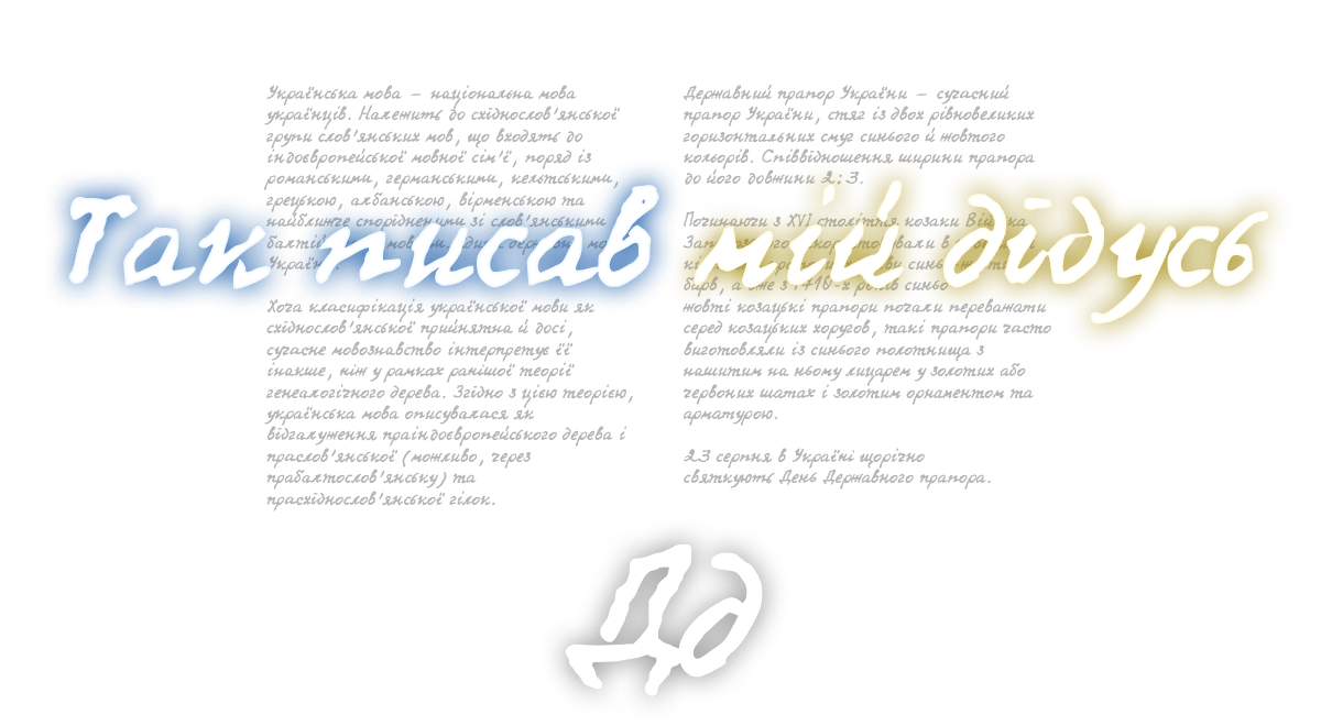
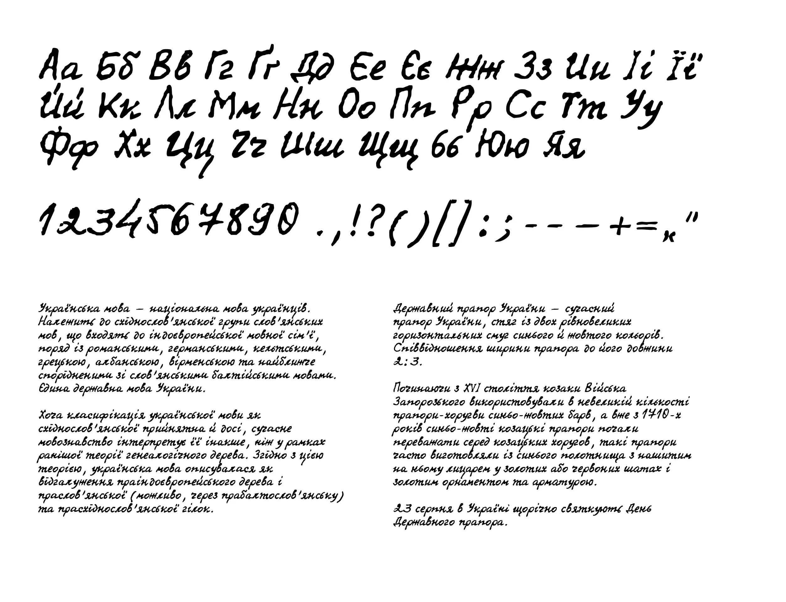
HOLysyi Font
This exclusively Ukrainian font has been made as a tribute to my late grandfather, Hryhorii Oleksiiovych Lysyi. Although the font captures his unique writing style, it will work well as a general handwritten font.
I made the font as a personal project and a design challenge. If you use HOLysyi in your project, please drop me a link to make my day.
The font may be used under the CC BY-ND 4.0 license. You are free to use it in a personal or commercial project—just don't modify it and include an attibution to my website.
About Me
I've been a product designer for over 13 years, but I've been designing and creating all sorts of things since childhood. I've never stopped learning and pushing the boundaries of my knowledge.
My numerous hobbies help me get a better understanding of the world and use this knowledge in my work: psychology, music theory and practice (both making records and playing live), snooker, graffiti, game design, particle physics, astronomy, linguistics, and many other interests I've had. In addition, I draw a lot of inspiration from great personalities in different areas.
I’ve built up solid academic vision of how things work and minds think. So, I don’t rely on bare instincts but rather on various laws, best practices and guidelines as well as on human psychology.
Thinking about working with me? Here's how you might benefit
To ship great result, I've been continually perfecting the skills I consider vital for my job:
-
Being a generalist.
I believe that a designer performs best with good knowledge of the context they are working in. Besides design, I've been studying development, management, law, copywriting, editing, analytics, user research, and system design. Seeing the whole picture fosters stronger decisions and better overall results. -
Problem solving and accepting challenges.
I welcome complex tasks as challenges and give in only if the game is not worth the candle. In case of emergency, I’ll look for the best solution for the time box. The TRIZ theory that I've been studying during the recent years is instrumental in coping with many challenging tasks. -
Cutting the scope.
It's been many years since I first heard about the “fixed time & budget, flexible scope” method. Since then, I've applied it to countless projects and tasks. Along with poring over Getting real and Shape Up!, I've been learning a lot from various designers who have been using the same method for ages. -
Tackling tasks systematically.
In my opinion, design is not equal to art. I always aim to conceive things as reusable, multifunctional as well as easily built and maintained. Systematic design makes both the product development and the user's adaptation to it more simple. -
Being a manager-of-one.
I’m used to working independently, therefore I don’t need someone breathing down my neck to get the job done by the deadline. Since I always aim to be proactive, I prefer responsibility and freedom to continuous surveillance. -
Working in a team.
No matter how good you are, it is difficult to do a complex work alone. I'm well aware that team work requires discipline, respect and focus on the overall result rather than just completing your own tasks.
In addition to the qualities that I described above, these are the benefits my clients get from my competence and experience.
-
💪 Strong design foundation.
My professional background is mainly shaped by the principles of various design schools with their unique philosophies and practices. I've been learning a lot from companies and personalities that are considered to be the drivers of modern design: Apple Design, 37 signals, Google's Material Design, Bureau Gorbunov, Iconwerk, Ilya Birman, Intuition Bureau and many other talented representatives of the trade. In 2016, I graduated from Bureau Gorbunov design school being in the top 10 students on admission and during the training. I'd be delighted to merge my expertise with your team's one. -
✍️️ Profound editorial skills.
That includes text editing, visual narration, the readers' motivation, improvents of readability, and other skills a professional editor will use in their daily work. -
💻️️ Proficient coding skills.
Over the years, I've aquired coding skills and learned how the development works in general. I always aim to establish a team work interaction between myself and the developers, so the final result would be more effecient. My knowledge includes solid Javascript, HTML, CSS, moderate Rails, a little SwiftUI. I have developed a few products of my own, including RealSnooker.Club and Letters.GE that are visited by tens of people every day. -
🧐 Distinct approach.
I always aim to get to the core of things and start from there. In combination with cross-knowledge of numerous subjects, such as planning, knowledge of development principles, and flexing the scope allows me to create original design entities without any compromise on their quality or functionality. I also make interactive prototypes for most of my designs to save costs on actual development.
What I'd expect from you
The product and the team are equally important. I always aim to ship work of the highest quality and efficiency, but I won't be able to do that alone. To do my best job, I need to have a strong team. Here's what I would expect from you as a company if you were interested in hiring me:
-
You're a class act.
I believe one should build their work on a firm set of standards. You aim to be noble, honest, bold and humane, and your employees share these values and appreciate such qualities, resulting in better daily work. -
You're innovative.
You love building things that push it forwards. You take bold ideas with excitement and avoid mediocrity. -
You're humane.
You never forget that there are humans behind the pixels in both the product and the work chat. You praise entrepreneurship but always value people over money. -
You have a lot to learn from.
You can offer something for a professional to learn from and become better. It can be either an interesting product, an innovative work process or a certain person. -
You're long runners.
I used to work for a company that would often chase quick gain at the expense of their reputation and the employees' mental health, driving everybody to a quick burnout. Conversly, you treat people delicately and provide a workplace where one can be productive, happy and willing to give their best in exchange.
A word from my colleagues
I asked some of my workmates a question: What they think makes me different from other designers they’ve worked with. Here is what they said:
-
Unlike many others, not only designers, but also programmers, managers etc., you realise that the goal of any work is an efficient solution to a problem. That is you always aim to get to the core of the problem rather than do just what you've been asked to. You'll never go “Here are the buttons and the checkbox that you asked for, I have no idea why you need them, but it's none of my business”.
From the point of programmer/designer relationship, your remarkable advantage is that you always think of how your design will be implemented instead of simply creating visually good though unrealistic pictures. -
Happy to do it. The thing I liked best is that you tie your work to metrics that make the business run. That is by far the most valuable thing. Your work is always focused on being impactful to the business, not necessarily on “this is very stylish”.
-
Well, let me outline this.
1. You’re a T-shaped person—in addition to being a designer, you can conduct system definition, perform user and product research, communication between teams, preparation of requirements, projects and processes management.
2. You’re always deeply immersed in the subject area and the problem you’re working on.
3. You’re independent and don't need a supervisor to motivate you and control your job.
4. You speak good English which is a very desirable and required skill.
5. You have a clear vision of your future as a designer. -
The first thing that came to my mind is that you are in fact a UX writer in addition to being a designer. Getting good copy is my personal pain as CPO, because non-native-speaking designers typically don’t know English very well, and their copies often need double-checking. Good quality text composition is part of good design, and I think that’s your strong feature.
-
Powers / advantages: patronage, the ability to solve problems with balance between investment and return, strong empathy and end-user perspective on solutions, good taste, autonomy and originality (it can be either a strength or a downside, depending on the team you’re working with), focus on the result rather than the process, and deep understanding of what the result should be like.
And one more thing. It seems to me that since you possess entrepreneurial traits, you may at times have a bit of a categorical position. It can be positive where a high level of autonomy is required and treated unfavourably in a large company. -
For me, your main asset as a designer has always been your thorough attention to details. If you study a topic, you look into it like no one else. This way you build up knowledge and skills applied to your further designs.
-
You don't just create good graphics but also write text for interface elements. You clearly deliver your ideas and never behave like a staunch fanatic. Yet you will reason from the point of view of business, not only the laws of beauty.
Suggest a project or simply drop a word: